Welcome!

I hope you find my writing and business tips and observations useful. My business and blog are dedicated to helping businesses communicate clearly and reach their potential. Read, subscribe to my newsletter, enjoy!Tash

Refer to older posts…

Blogging services

HCI chat

simple

Keep it simple…

Dripping tap in a house

Simple but clear – this image tells a story without trying to impress or be more than it is. This makes for good communication.

The purpose of the written word is to communicate.

Sometimes that does include some complexity but I strongly believe it should be kept as simple as possible. Why make people work hard at understanding and increase the risk of misunderstanding?

I recently came across the following:

Email us to inform us about updates regarding your personal information.

And it struck me how some people try to impress and seem ‘professional’ by using complexity when it really isn’t needed. In the example above, why not just write:

Email us with any changes to your contact details.


Are simple messages simplistic?

IQ of 134 means smart (simple) but maybe good at school (simplistic)

Simple and simplistic are not the same…

While being closely related with the same root word, today’s pair of words are quite different – and understanding them can be quite enlightening. 

simple [adjective]: basic; missing elaboration, ostentation, complication and subdivisions
Basic arithmetic is simple to write and calculate; quadratic equations are not so simple!
Following main roads is simpler than maneuvering through side streets.

In grammatical terms, simple means having only one clause without any subordinate clauses or modifiers.

simplistic [adjective]: over simplified, missing information or depth
Saying income is the indicator of career success is simplistic.

Avoiding fluff keeps the message clear

Whatever message you are trying to convey, the clearer you can make it the easier it will be to understand and remember.

Generally, a shorter, simpler sentence will explain a message better than a long, complex sentence. Or paragraph.

Giving unnecessary options

I recently came across this sentence on a website form:  ‘credit card details only needed if posting this form’.Filling in f a form to mail in envelope

It seems simple enough – we don’t need your credit card details if you send us the form electronically or by courier pigeon. So if you’re not posting the form, save yourself the trouble of filling in half our form is the subtext.

One slight problem though – there was absolutely no way to submit their form except by posting it. The form was just a pdf to print off – there was no online submission nor was there an email address or fax number to be seen on the site.

So what they’re really saying is ‘fill in the credit card details’.

Check if it is needed

I think it’s pretty simple – if the information is meaningless (like credit card details for unavailable options) or useless, delete it.

Sometimes it’s a matter of reading through your words point by point and testing them out.

Sometimes it works better to list what is necessary then go to the text and assess everything not on the list – it may add value so you keep it but otherwise, delete it.

This is just as important when you change something as when you first write it.

In our example above, they may have had email details on the site but removed it to reduce spam and forgot to update the form reference.

When’s the last time you filled in a form on your site or followed your sales process to check it all makes sense and works? Did you read every word to be sure nothing pointless is in there?

Simple words, simple fonts

I often suggest using fewer words to make reading your message simple and easy.

Roger Dooley, author of Brainfluence, has added a new form of simplicity to effective communications – simplicity in fonts.

Research has shown that ornate fonts make a task appear to be more time-consuming than the same task written in a clearer, simpler font. An ornate font could actually make your products and services seem slow or tedious, which is obviously not an image you want to promote.

Dooley stated that a simpler font will communicate your message better because it is easier to read and looks easier to read (i.e. is more appealing). Just like a simpler message is easier and more appealing.

What do you think – does a fancy font impact on how you perceive a product or service?

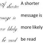
Shorter messages and clearer fonts make writing readable

Which font is clearer?

PS The recommendation is to use a clear font such as Arial for descriptions and instructions.

Good blogging made simple

A colourful, interesting blogBlogging can be fun, it takes time, it can have great rewards for a business. For some, like me, thinking of topics and writing blog posts is fairly easy; for others, writing blog posts can be hard and nerve-wrecking.

So here are ten quick tips to give you confidence that your blog posts are going to work for you, not against you.

  1. use a spell checker (within the blog software or elsewhere) and a grammar checker (tied in with many spell checkers now anyway)
  2. read your blog post out loud as you proof read it – your tongue will stumble over mistakes you may otherwise miss
  3. whenever possible, leave a day or two between writing and proof reading and editing your posts
  4.  relax and be yourself – a blog should show some personality and make the business human. A professional image does not mean you have to be stuffy and intellectual
  5. write for humans, not search engines. It is important to include keywords but not at the expense of making the content easy to read
  6. if you have little to say on the topic, write a short post – don’t add a lot of fluff and nonsense just to make it look longer
  7. if a post is getting very long, consider dividing it into two or three posts – it’s easier to read, more visually appealing and you get more posts for not much extra effort!
  8. ask questions and invite comments – the interaction can lead many places and adds a new dimension to your blog. Reply to comments, too, but that comes after writing the posts!
  9. make the post easy on the eye – use sub-headings, images, bullet points, short sentences and short paragraphs as appropriate
  10. make sure facts and opinions are clearly shown as such – facts need to be accurate and you don’t want anyone thinking your opinions are presented as facts. For your opinions, make them real – it’s ok t be controversial as long as your stand suits your brand

As you build confidence, there are many more things you can do for your blog but getting started and attracting readers is the first and shot critical step. Good luck, and enjoy blogging!


Navigating your website

Part of establishing and managing a site is making sure that the information is easy to find – the design and content are important but with a poor site layout, they are not going to work as well as they should.

In short, navigation is about letting people travel around your site easily to find what they need.

While you may well link to various pages of your site within the content (and I strongly suggest you do!), this is not part of the planned navigation. Navigation is more about menus and major links (such as banners and graphics on landing pages).

For the most effective navigation, it needs to be simple and not offer too many choices so it is worth thinking about what people really want to know when they visit your site and what you want them to know. Once you have refined the key areas, you can put them in as menus and key graphics (either graphics that link to relevant pages or graphics that give the information directly).

Some key data to make easy to find includes:

  1. your contact information
  2. your physical location (especially if you want people to visit you)
  3. delivery information, including costs
  4. hours of operations (if relevant)
  5. what you do (and don’t do in some cases)
  6. prices and related terms (for example are your prices in AUD or euros? do prices include local taxes?)

Don’t be surprised if getting the navigation sorted takes a while – it is important to get right and can involve a number of steps. Once you have a draft navigation planned, I suggest the following actions:

  1. leave it for a a few days and then check if it is simple and effective
  2. test it – think of a question someone might want answered and try finding it through your proposed navigation
  3. ask your web designer and content writer what they think of it – their experience will provide good feedback
  4. get others to test it for you – if they find it confusing or distracting, change it even if it passed all other tests perfectly!
Before you get stressed or give up on your website at this point remember that you can change the navigation later (nothing is set in stone on a website) and good content with lots of informative links will compensate for some navigation weaknesses. You can work with good navigation while you aim for perfection!

This post is part of Word Constructions’ Setting up a website series
1. having a website helps more than you
2. what’s involved in setting up a website?
3. Learn about web hosting
4. Preparing your initial website content
5. Managing website design 101
6. Choosing a web designer
7. Basic web pages

Meaningful posts that people love to read

happy readerI’m going out on a limb here but I assume you write blog posts and articles because you want people to read them for some reason (promote your business, share your point of view, etc). If I’m wrong, perhaps another post will be more meaningful for you!

I see two simple rules for getting people to love reading your posts/articles/newsletter:

  1. providing substance is more important (meaningful if you like) than just stringing together relevant keywords
  2. people who like what you write are more likely to come back to read more, and recommend it to others as well

I was prompted to write about meaningful posts by reading an article that sounded interesting. That is, the heading was about whether or not to build a website and it started by discussing the increased sense of needing a website in the small business sector in recent times. However, that’s as far as the article went – it gave a case study of someone struggling to get their web designer to finish a job and then learning building the website wasn’t the end point anyway.

From this example, I think we can learn

  • if you create a question or interest in a heading or introduction, you need to answer it within the article
  • each post/article should be on one topic – not reasons for website growth, optimisation and a case study rolled into one. One topic is simpler to read and understand, and splitting other topics out gives you more articles/posts to write anyway!
  • include something that makes it worth the time to read the article or post – generally this means give some information or insight, but it may mean entertain in some way. The article on building a website left me feeling I learnt nothing and therefore wasted my time – the result being I won’t be heading back for more of their articles

So next time you write for your blog, website or newsletter, ask yourself if you have made it meaningful and of value or if you have just put together some space filler. And then check if there is anything you can do to make it more meaningful.

Short and sweet

Do you remember writing essays at school where you had to make up content to fill the required word count? Do you prefer to read a long book over a short one?

In business and website writing, the clichés ‘short and sweet’ and ‘less is best’ are better options than writing a lot for the sake of writing.

Why keep text short?

Lots of pages are flicked not read

Long documents intimidate

  • people are busy and want to get the information fast
  • it tends to be clearer and simpler
  • it looks less intimidating so more inviting to read
  • it is easier and quicker to proof read!

Keeping it short means short words, short sentences, short paragraphs and short result.

So ‘about’ instead of ‘in respect of’; ‘Accountants advise businesses’ rather than ‘business get advice and recommendations from people experienced with accounting’; and ‘stocktake sale’ rather than ‘reduced prices at the end of season to reduce our stock levels’.

Of course, short in the extreme is not the answer either. I use the idea of ‘if it can be done with fewer words, then do it’ rather than making everything short.

When keeping text short, remember

  • it must make sense
  • all critical information must be included
  • keep it easy to read and suited to your audience (for example, ‘because’ is actually longer than ‘due to’ but is used more commonly in speech so is often the better choice)
  • avoid jargon your readers won’t know

Clear definitions…

I looked at a website today that is trying to explain technical terms to enhance their sales – a good concept of course, but if the definitions aren’t clear I think they’d be better off without them.

This is pretty much the first thing on their site:

What is “Domain Name”?
Compared with IP address, Domain Name is a character sign which is like a doorplate number on internet, it’s used to identify and orient hiberarchy of computer on internet.

Ok, English isn’t their first language, but their site is in English so it needs to be understandable in English! Even if we change ‘hiberarchy’ to ‘heirarchy’ it still doesn’t help explain a domain name – and I actually know what a domain name is!

Moral of this story – make sure a definition is easier than the term it is meant to explain! I suggest using the simplest words possible when writing  definitions so people can concentrate on the definition rather than the words you use.


P.S. Try my article for a longer but simpler explanation of domain names.