I hope you find my writing and business tips and observations useful. My business and blog are dedicated to helping businesses communicate clearly and reach their potential.
Read, subscribe to my newsletter, enjoy!Tash
If a customer has a question, they want you to answer it – and preferably as soon as possible so they can move on to the next step.
Answer potential customer questions to get more customers
Look at your website, brochures, social media profiles and other written messages – do you answer customer questions?
Smaller documents can only answer a few questions, obviously, but make them important questions (like how to contact you for further answers!)
Scary questions
Some businesses are scared of people asking a certain question – or act that way anyway.
Why not stand out by being the brave business? It is honest and gives customers fewer things to worry about because you have answered their questions.
And it gives you a chance to make things more positive, too.
So a dentist website can include “will it hurt? Well, yes it might but we’ll warn you and do whatever we can to minimise it.”
Here are some more industry specific examples…
personal trainers: ‘do I really have to work out in between visits?’ ‘Only if you want the best results!”
accountants: ‘am I going to have to dig out all my old receipts?’ ‘I’m afraid so – the more receipts we get, the more we may be able to get back for you at tax time!’
editors: ‘will you really point out all my spelling mistakes?’ ‘Yes, that’s what you’re paying us for – but we promise not to make you feel bad about any of them!’
online shops: ‘do you charge postage and delivery?’ ‘Yes we do. We decided to charge official postage rates rather than increase the prices of everything to cover delivery.’
Do you answer any potentially negative questions in your materials? How have clients responded to those answers?
If you want some ideas on what questions customers may silently being asking – and how to answer them nicely – then contact me soon so we can help your customers find what they need.
I don’t watch politics for fun. In fact, I don’t like politics very much at all and I often find their behaviour childish. Childish in a way I wouldn’t tolerate from any actual children…
Yet I am going to write a blog post inspired by a politician and Saturday’s election. It is mainly about their communications so no need to hide from another political statement!
Checking my options
I am proud of Australia and am willing to welcome refugees.
Earlier this week, I went to a number of websites to find out more about the smaller parties. Namely because I can’t bring myself to vote for either major party this year – blocking refugees asking for help is simply wrong.
On each site, I looked at their policy ideas and details on their candidate in my area.
Learning from their websites
Based on reviewing a few sites covering the same basic idea (ie what the political party stands for and why we should vote for them), here are some useful website tips for us all:
Summaries and simplicity are good.
A short summary of each policy area with a link to greater details made one site much easier to read and quickly gave me an overview of the party. The lists of actual policies were also brief and to the point. It was therefore easy to decide whether or not I liked them.
Other sites waffled on or gave me a long list of policies to choose from which was more intimidating than a single-page summary.
Dead links are frustrating and reduce your credibility.
One site had my local candidate listed but every link on his name took me to an error page. Given I found the rest of the site a bit vague, I really wanted an impression of him to make a decision. Instead, I was frustrated and didn’t feel the party was very professional or reliable.
Explain who you are fast.
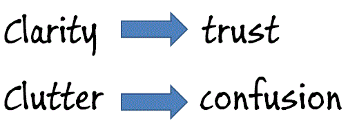
One site (and I spent very little time on their site once I started reading their offensive nonsense, so maybe there’s a reason for their web design!) had a huge banner and blog posts on the home page. It gave me no idea of who they were (not even that they are in fact a political party) which is what I wanted to know – their latest news is in the realm of politics I don’t care about! A clear tagline, an introduction or useful imagery can give information to site visitors quickly and makes life easier for people.
Show information, or don’t – changing is annoying.
I clicked through to an inner page which was basically a list of questions. Initially, I saw questions and answers but as I was part way through reading the start of one answer, it disappeared to show me a list of questions. Obviously, their software is set to narrow the content to just the questions but the loading time was so slow it showed answers first. Very frustrating to deal with as a site visitor.
Have you checked how your clever settings actually work for site visitors? Often a simple solution works consistently so is better than a fancier option.
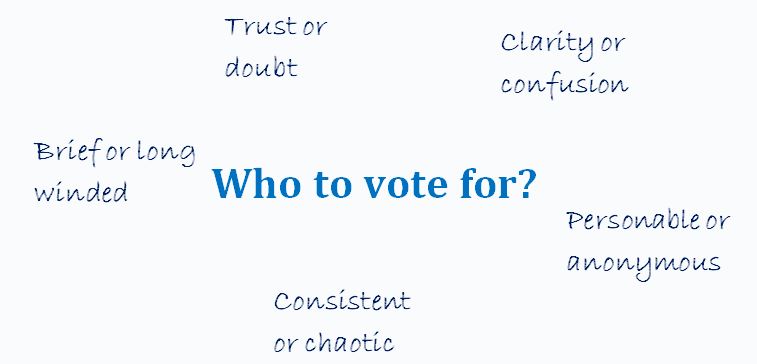
What characteristics are important in choosing where to vote or spend your money?
Learning from the candidates
Remember how I couldn’t find information about my local candidate above? I found a media release about him and some others in his party which my local candidate had replied to in the comments.
There is both good and bad to be learned from those comments…
His first comment was long. Maybe a third of a page without paragraph breaks long (lack of structure may be due to the software, which is on the party not him, so I’ll give him a pass there!) It started with a lot of impressive words strung into a sentence or two that made absolutely no sense. Instantly I had no faith in him and no desire to vote for him.
The lesson – make sure anyone representing your business online can write reasonably well or do it for them. A genuine message is better than trying to impress readers.
However, I will give him credit for answering multiple people’s questions to the media release. Responding to comments and questions showed enthusiasm and passion, and listening to people is a precious commodity when it comes to politicians.
Yes, some of those answers were long winded and were nice ways of fobbing off hard questions but he was trying.
The lesson – respond to people online to build rapport, show your personality and gain another opportunity to explain your purpose or skills. Remember, people may see this rather than your carefully crafted profile – especially if a link is faulty!
What have you learned from this election?
Have you come across examples where a politician or political party has communicated well or poorly?
Maybe some of the above examples have inspired you to check your own website with a different perspective. If so, I’d love to hear about it in the comments below…
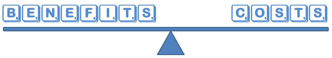
While I am not going to vote for a party just because they did the best job with their website, being able to easily understand the party does influence my choices.
Just like as a business owner or consumer I am not going to buy something just because you have the prettiest website, but I am more likely to trust you (and thus give you my money!) if your site is professional, simple to use and inoffensive.
But based purely on my descriptions of their websites, who would you vote for from the above examples?
Personally the first site I mentioned would get my vote – their summaries and easy-to-navigate site made it easy.
Maybe it seems a little back to front. I mean, first I reviewed some online chat software and now I am writing about whether or not adding online chat to a website is worth considering.
For me, that’s the order things have happened – I did the research because a client asked me too. And now I am thinking about adding chat to my site as well.
Of course, I could wait a while and see how chat goes for my client… Yet again, their business is so different to mine that any data would probably have limited value.
So what’s so good about offering online chat functions?
Here are what I see as the reasons for adding chat to a website…
you appear approachable and interested in helping potential clients
you can solve issues quickly – no waiting for emails or loosing people because they can’t find the answer they want from your site
some people prefer to interact online instead of via the phone – and I suspect this tendency will increase
an online chat can be quicker and less intrusive than getting a phone call
by answering immediate questions, you can learn what people want to know when visiting your site – and maybe what is missing (or hard to find) from your site
as a service provider, it can also be a great customer service tool for existing clients
for someone like me, knowing how to use a new feature can be beneficial in advising my clients
And what’s NOT so good about adding chat to your site?
If online chat was perfect for every website, we’d all have it, right? So here are some downsides to adding an online chat function…
it costs money – there is quite a range of prices but you are likely to pay for the software and maybe hosting
it will take time to set up – choosing a supplier, adding the code to every page on your site, customising the system to match your site/brand/clients
there may well be time and money in getting a designer involved to integrate things nicely into your site
it’s a new tool to learn how to use
it’s potentially a distraction – being interrupted as you work and having a new set of stats to look at and worry about
if you can’t be online a lot of time when your clients may expect you to be, it may give an impression of being unavailable or disinterested. Most software shows you are offline – yes, people can leave a message for you to get back to them, but not all will and the offline message may not be great. Some software has the chat button disappear when you are offline so that could be a solution if you are frequently unable to monitor chats.
it may not suit your audience. Taken to extremes, a blind audience is more likely to prefer phone calls to online chats, but there would be less extreme examples where chat would be a waste of effort to install
being live, you need to think faster than if answering an email or even updating social media. If writing (or writing clearly with good spelling) is a struggle or you’re concerned with being 100% accurate, then an online chat feature may be intimidating
Making the choice
Have I missed any other points to consider?
I think it’s also important that a website gives the right impression. Do you think online chat is suitable for professional businesses or perhaps just for more informal or technology businesses?
Or put it this way, would you ever use an online chat feature on a professional website?
I have been researching online chat software for a client. There are a lot of options available so I thought I’d share some of my observations for anyone else who may be thinking of making their website more interactive.
Of course, these are my personal opinions and experiences, and are based on a user’s perspective. I looked at many websites, compared features and made a short list of six suppliers to try – this is my short list.
Online chat suppliers
I will list these roughly from best to worst so you can skip the rest of the list once you’ve found one to suit you. I’ve added a couple of explanations at the end, too, so you can understand their terminology when visiting their sites.
Prices listed are as listed on their sites – presumably in USD so at least comparable to each other. You can convert to local currency online if need be.
Note many of these have an affiliate program if that is important to you. I am not an affiliate with them (I won’t promote products/services I wouldn’t use myself!) and note that the ones I like best either don’t have or don’t promote an affiliate program – I wonder how coincidental that is?
Works across browsers & platforms (including mobile)
detailed stats reports (easy to export)
multiple chats
unlimited operators and the ability to chat with other operators (eg ask them a question to help a customer)
offline contact form
searchable archive of chats
track & record visitor data
transfer chats between operators
customisable
pre/post survey
$9 = 1 operator online at a time, no customisation, their name; $29 = 4 operators, no customisation; $69 = 8 operators, customisation. Note an annual payment discount applies.
Many help videos
Can save/print/email offline transcript easily (as can member) – but Banckle staff can’t access them
this was actually at the top of my list until I tried it
Free 30 day trial
Free WP plugin to include chat on a blog (last updated Nov 2012)
Mobile access
customisable
visitor tracking, stats & reports – but I couldn’t find any stats within the admin area
no contracts, no software to download (just code to site)
pre chat survey
offline contact form (or hide)
incoming seen by all online
pre prepared responses
multiple chats
integrate with FB or google talk
records transcripts
Free – 1 operator, 100 chats
$10 per month – 5 operators, 3,000 chats,
$20 per month – 10 operators, 6,000 chats
simple to install
button on the site sits below the footer despite changing settings to put it elsewhere
Can’t change time settings to local (eg transcripts will show 5.30pm when it is 11.30am for me) which will make tracking chats more difficult
chat works through my client’s strict firewalls but dashboard access shows an error message
Transcripts emailed instantly & easy to access in backend. Can’t delete them so they are there forever
Links appear as text not a hyperlink – push feature described on the site but the relevant buttons not visible in the admin area
Cloud based storage
Service very poor – chat operator can’t answer how-to questions and they never emailed me back
Online chat glossary
operator – the person who answers the chats for the business. If you have a system with multiple operators, you can usually personalise it and use their names; if you only have one operator function but multiple staff, they will have to share a name.
pre-prepared response – often called a canned response. SImply a commonly used answer or question that is added to the system to save time and typing during a chat. For example, I could have ‘Yes I write guest blog posts’ or ‘My monthly newsletter is free to subscribe to’ as canned responses.
pre-chat survey – the ability to ask some questions before allowing someone to chat with you. Common questions are name and email address but you can add things like ‘what do you want to ask about?’ or give them a choice of departments to chat to.
permanent window – the chat window will stay open and visible even if the visitor changes pages within your site. This is most relevant if the chat window is not a pop up window (ie is embedded into the page)
How do you decide?
If you are looking at doing something like adding a new feature to your website, how do you go about the process?
I love the simplicity of just grabbing one option and running with it, but I would never feel I had the best deal unless I had looked at other options as well. I like to shop around a bit – even if that just helps me learn more about the features to look out for – then create a short list and decide.
Do you need to look at options yourself or are some good reviews enough for you?
If you run a business website, it makes sense to have it help you sell stuff, right?
But have you ever looked at your website to see if does help you sell stuff, or if it makes hard work for your potential customers?
A recent review of websites…
I have been looking for some software for a c lient without any prior knowledge of any relevant suppliers. So I was relying entirely on what I found online.
Not surprisingly, I looked at a few sites.
I started with the top site listed in Google AdWords and found…
very small font that was hard to read (lucky I don’t have poor eyesight to start with!)
after 5 minutes, I found a small link on one inner page that showed me a demonstration of the program (for a function I didn’t actually want) – otherwise no screenshots or demonstrations are on the site
the list of features includes things like “enables businesses to focus on their skills” and “proven reliable since 2000” – it doesn’t answer questions about the capabilities of the software to the point that it really isn’t a list of features at all
there are no prices listed on the site to give me any guidance as to the quality of their product or if it’s within budget
I decided I didn’t trust them with my email address or phone number so they are not a potential supplier
So I went to the second site listed in Google AdWords to find it…
looked much better than site 1 – it was clean, easy to read and not text-heavy
the prices and features pages were just contact forms so the site was actually information poor
I noted the footer mentioned an affiliation with a company I know overcharges like a wounded bull so I closed that window, too
Thus I moved onto the third site in Google AdWords…
it was professionally laid out, gave clear direction to relevant parts of the site and written with a consumer in mind
they provide a 30 day free trial which built my confidence in them
includes a clear list of ‘for $x you get these features’ so I could assess if it suited my needs and budget straight away (and no need to waste their time on a non-qualified customer)
all packages even include a webinar on how to use the software, available to all my client’s staff – this is a great bonus and probably cost very little to produce
I trusted this business but the features my client needs weren’t there unfortunately – at least I knew that quickly, though
Next, I looked at the fourth site from Google AdWords and saw
lots of white space on the page and an overall professional look and feel
clear answers to key questions, followed by a list of benefits (eg saves time and improves revenue) and some testimonials – all on the home page
home page has a button ‘instant demo’ so I can see what is on offer and mentions a 30 day free trial – instantly developing my trust. And 30 days money back guarantee effectively means you get 60 days trial!
the home page has a feed from their blog – with 3 items from the last two weeks showing me it is current and they maintain their site
the pricing page is a comparison table of their plans, clearly showing the actual price and included features
their main menu includes ‘help’ which leads to a knowledge base and a lot more details than I need to know at this stage. Note the excess information was not in my face to overwhelm me, but it easily found which again builds my trust
I recommended this supplier to my client and we have since trialled the software and it is working very well in tests.
I actually looked at a couple more potential suppliers, but these four showed the absolute importance of a good website to help you sell to prospective customers.
be careful with the use of JavaScript – make it usable without a mouse and make pages work without JavaScript
design to w3c standards – CSS sheets help readers separate out presentation details from the content; html pages are easier and actually more SEO effective
Following these principles
Making your website accessible makes sense.
The principles are fairly simple and non-expensive to follow. I know I adhere strongly to some of them – and others I just didn’t know or think about. And some aren’t so relevant (for instance, I don’t use JavaScript on my site).
Which of these principles do you follow all the time? Which did you not realise were possible or an issue?
I know it will take me a bit of time, but I am going to work my way through that list (well, the ones I haven’t done in the past) so I can learn how they work and implement them. Starting with form labels and table headers as I didn’t know these existed before now.
As I learn more, I will share that knowledge – the more awareness we share, the more we can make the internet accessible and inclusive. Will you help make it so?
Why wouldn’t we want to make our website accessible to all sorts of people, including people with limited abilities (such as visually or hearing impaired people)?
I read yesterday that a court case in the USA is showing that many sites are not easily accessible to the disabled (visually impaired people on this specific case) and may actually be breaking the law by excluding accessibility considerations. Legal aspects of accessibility I know nothing about, but morally and from a business perspective, I know an accessible site is a good aim.
Why make your site accessible?
Well, why not really?
The obvious answer is that the more accessible your site is, the more people can visit it and so you increase your sales or influence by having a bigger audience. Making it accessible also builds trust and credibility for you and your brand.
Also obvious is that you are welcoming all people and being a decent human being to not make life harder for certain groups.
Would you build a cafe and not have a ramp for wheelchairs/prams or refuse to describe your menu to someone who couldn’t read it? Of course not, so why not do the same with a website?
Computers can do many things these days, so don’t assume a blind person can’t read websites so doesn’t go online. There are tools that read webpages to the blind. There are anti-spam tools that rely on audio for those who can’t read the captcha images. Text on websites can be expanded to be seen by those with limited vision.
And so on.
For someone who finds it difficult to hold a book or turn pages of a magazine, how much easier is it to move a mouse and read on a screen? Or use a verbal command to flick between webpages?
Just like a computer reading a webpage is easier than getting someone to read to you if you have limited vision.
Or a website offering written transcripts of speeches and presentations enabling the deaf to know what’s going on.
Or being able to search for a website that offers an understandable version of something for anyone with intellectual disabilities.
We can make life easier for people
The internet has opened so many doors for us as a society.
As website owners/managers, we can open those doors further by making our websites accessible to the disabled.
I have long added alt tags to images, for example, so a visually impaired person can be told what the image is about.
There are other things that are easily done that I wasn’t aware of. Now I am aware, I will start implementing them.
My next post will list some of the ways we can make our sites more accessible.
But what do you do on your website(s) to make it W3C compatible and accessible? Why do you make it accessible, even to a small extent?
There are two main reasons people visit a website – they want information on a topic or they want information about the business behind the site.
So why do some sites avoid sharing anything about themselves?
Add an about us page to your website and blog
As Chris Lake wrote, an about us page “is surely one of the only true rules of doing business online. I can think of no good reason why you wouldn’t have one.”
An about us page can be very simple but it can make a huge difference to people thinking of doing business with you.
For a stand alone blog, it lets readers know who is writing the posts – for instance, is it a business or an individual, is it by an expert or someone learning the topic, or is the blog focussed on a specific topic or just a collection of ideas.
For a business website, it can build enough credibility for me to do business with you – or not.
How ‘about us’ can build credibility
you are being open and transparent compared to making me wonder why you are hiding things – no name on a website instantly makes me suspicious
providing history shows the business is more than a fly-by-night – if you’ve been in business for a few years, you must have done something right!
explaining how the business began or the passion behind the business will certainly give me a believe in the intent of the business and its owners
introducing team members can give me an idea of what skills are available for me as a potential client
listing values or just writing a personal story can show the company culture
I have an about us page on my website and as part of my blog, even though they are on the same domain, so it is easy for people to read about me and my business. I wonder if I’m brave enough to ask if you have read either of them!
How important is an about us page when you are assessing a potential supplier or service provider?
Earlier this week, we looked at how shallow websites are not as valuable for your visitors or your SEO efforts so let’s look at how to improve that situation.
Shallow content is giving the minimum so by default giving more is adding depth. Simple.
How can you provide more depth to your content?
generally provide more information but be careful to not just pile on so much information people get overwhelmed – there is a balance between too little and too much that will vary between pages and sites
link to relevant information (on your site and elsewhere) to enhance your content without cluttering up pages with too many words and facts
consider adding fresh content regularly. This could be via a blog, a social media feed, a news feed, articles or uploading your newsletter.
look at every page of your site and review the content to ensure it meets the purpose of the page and answers any likely questions people would have on that topic. For example, expand on your services so they are meaningful – ‘business bookkeeping and reporting’ is better than ‘bookkeeping’ – and give some background on your about us page.
look for ways to add value to people. Some examples are a hair dressing salon adding hair care tips after each service listed, a legal firm linking to definitions of common terms for relevant areas of law, and a book store including guidelines to the age suitability of each book
only create a new page when there is something to add – new pages created with the same information focussed on a different keyword is not adding value and is more likely to annoy humans and search engines
where relevant, add reviews and testimonials to your pages as they provide relevant content from a different perspective
if you can’t see how to add depth, but suspect you need to, get others’ opinions on various pages. Remember your target audience when choosing who to ask
following the usual rules of easy reading (good spelling, grammar, flow and being concise) will make any value stand out better than a page of words that are hard to interpret – sometimes adding value is done by removing the junk!
add tips and ‘how to’ notes where relevant – for instance washing instructions with every clothing description and alternative uses alongside certain products can provide true value to people and potentially increase your sales
What have you done to add depth to the content on your site? Do you think this is something to get help with or easy enough to manage by yourself?
A new term around at the moment refers to shallow website content, meaning content that meets any minimum expectation without any additional information or resources.
Consider the contact us page on most sites – there is very little content other than contact details. That is shallow content – although highly appropriate for a contact page!
Imagine that level of information on other pages of a site – for example, I followed a tweeted link today to a blog post that was purely a title and a link. It can be very frustrating for a person wanting to learn something if a page gives so little information, but shallow content has worked in the past for getting search engine results.
One of Google’s plans, apparently, is to make information-rich pages rank better than such shallow pages. I say bring it on!
So before Google makes that change, maybe now is the time to build up the content on your website. Even adding depth to one page a week or fortnight will improve the experience for your site visitors, so what have you got to lose?
So, is your website shallow? Are there obvious questions people would have that you are not answering?


 As Chris Lake wrote, an about us page “is surely one of the only true rules of doing business online. I can think of no good reason why you wouldn’t have one.”
Recent Comments