I hope you find my writing and business tips and observations useful. My business and blog are dedicated to helping businesses communicate clearly and reach their potential.
Read, subscribe to my newsletter, enjoy!Tash

Simplify online forms for everyone’s sake
Filling in the account details on a website form today I was reminded of how difficult things can be when someone assumes knowledge.
Yes, we all KNOW that if you assume you make an ass out of u and me. But that doesn’t stop many of us making assumptions that we shouldn’t.
And I suspect that online forms is one area where people just get a form put together quickly without really thinking about making the form easy to use and highly effective.
Simple text, plenty of white space and provided options make a form much easier to fill in.
Contact forms need to be simple to use
Today, I was faced with two boxes under the title ‘Your name’.
So I had to figure out if they wanted Tash then Hughes or Hughes then Tash, or maybe Tash Hughes and the second box shouldn’t have been there at all.
It was obvious to the person creating the form what they wanted, but not so obvious to me, the paying client.
With just a little more effort on their part, the form could have been better labelled or set out and thus been much simpler to use.
Complex and unclear forms lose sales
I reread a blog post recently that gave a perfect example of how a simple form impressed a potential client – and a vague form (that was also hard to find) turned that client away from the business.
A poor form can be that serious – people may not be patient enough to work through the issues so you could lose a customer. And possibly earn some bad comments elsewhere.
Making your forms simple
There are many ways to simplify a form, whether it is an order form, contact form or an online survey/feedback form. And what works with one form may not work well with a different form, so there is no simple answer for making your forms effective.
However, here are some generic tips to help you keep your forms simple:
- think about what information you really need to meet the purpose of the form THEN write the questions to gather that information. And decide which of those answers is a must-have, and which can be optional
- think about who is going to use your form then choose wording and question styles to suit them as much as possible
- use one label per box*
- provide options to choose, rather than text boxes, where possible. So a street or suburb field needs to be empty but you can give a choice of states
- in a select an answer question, don’t give more options than necessary – if your provided answers don’t cover all possibilities, add ‘other’ or ‘custom’ as your final option
- reduce clutter around the page
- use clear wording to explain what you expect in each field
- use consistent wording. For example, if the first field is ‘your name’ make sure the next field is ‘your address’ not ‘my address’
- make the final button obvious – both in placement and size but also in the text you use. It is more effective to have a button that says ‘place order’, ‘send message’ or ‘request quote’ than plain old ‘submit’ – just like the ‘tweet’ button on Twitter and ‘publish’ button in WordPress.
Got any questions about making your forms simpler and effective? Why not ask below as a comment, or send me an email?
* If you are using a form with one box per letter (usually only for printed forms), this tip becomes use one label per obvious group of boxes.
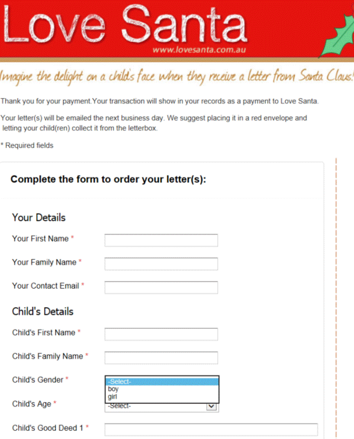
Image of form courtesy of Love SantaAvoiding fluff keeps the message clear
Whatever message you are trying to convey, the clearer you can make it the easier it will be to understand and remember.
Generally, a shorter, simpler sentence will explain a message better than a long, complex sentence. Or paragraph.
Giving unnecessary options
I recently came across this sentence on a website form: ‘credit card details only needed if posting this form’.
It seems simple enough – we don’t need your credit card details if you send us the form electronically or by courier pigeon. So if you’re not posting the form, save yourself the trouble of filling in half our form is the subtext.
One slight problem though – there was absolutely no way to submit their form except by posting it. The form was just a pdf to print off – there was no online submission nor was there an email address or fax number to be seen on the site.
So what they’re really saying is ‘fill in the credit card details’.
Check if it is needed
I think it’s pretty simple – if the information is meaningless (like credit card details for unavailable options) or useless, delete it.
Sometimes it’s a matter of reading through your words point by point and testing them out.
Sometimes it works better to list what is necessary then go to the text and assess everything not on the list – it may add value so you keep it but otherwise, delete it.
This is just as important when you change something as when you first write it.
In our example above, they may have had email details on the site but removed it to reduce spam and forgot to update the form reference.
When’s the last time you filled in a form on your site or followed your sales process to check it all makes sense and works? Did you read every word to be sure nothing pointless is in there?
Match questions and answers…
Recently I wanted to make a complaint to a company and was directed to their online form (hmm, is it telling that their products come with a prominant page about how to complain??) and saw this as the opening sentence:
“already been attended to by phone or other means would you please advise YES/NO”
How does it help them to know I will (or won’t) advise them on whether my issue has already been dealt with? Wouldn’t the better question be ” Have you already told us about this issue? YES/NO”
Whenever you give people a choice of answers in a survey or form, you have to give answers that actually give the information you are after. Remember that the words ‘would you’ are what people will try to answer, so put them at the start of your question or don’t use them at all.
Generally, use active verbs and phrase questions as simply as possible to avoid confusion and misunderstandings.
PS I could go on to say how important it is to get your promotional materials right – and not use old materials after you make changes. My original complaint was about their promotional brochure offering 4 things in a set but their website offering two things for the same price. Putting these two issues together has totally destroyed that company’s credibility and I don’t trust a thing they say now – and won’t be returning there.
Online forms are part of your image
Yesterday, I wrote about an online form (on a major company’s website I will add) that only appeared to offer me any choices when filling it in.
It would be nice to say that was the only issue with their form but the whole thing looked unprofessional and inappropriate to me – not something they can be proud of and use to enhance their relationship with me. And let’s face it – if I am making a complaint, they really need to be impressing me to rebuild our relationship if they want me to continue as a customer. Continue reading
Genuine Choices
I have just been to my ip provider’s website to lodge a complaint after 2 days of emails not arriving. Their online complaint form has many fields (too many in my opinion but I’ll let that go!) and most are marked compulsory.
One questions, marked as compulsory to answer is “Would you like ABC to contact you? Yes Email Address”
In other words I have to say yes I want you to contact me in order to submit the form! Why bother asking if I have no choice but to agree to it?
So if you are preparing any sort of form or questionnaire, make sure you give people a choice rather than pretending to give a choice. If you are not going to give them a choice about something, be honest enough to say there is no choice – anything else just makes you look foolish and/or deceitful.
Use your words and questions wisely!
Recent Comments