Welcome!

I hope you find my writing and business tips and observations useful. My business and blog are dedicated to helping businesses communicate clearly and reach their potential. Read, subscribe to my newsletter, enjoy!Tash

Refer to older posts…

Blogging services

HCI chat

A rose by any other name

Last week my father-in-law died.

A red rose with dew drops

A red rose is beautiful and simple – nothing more is needed to be said.

So it’s been a hard week and I haven’t posted in the meantime.

I also haven’t listened to all the Problogger sessions thus haven’t shared any more ideas nor implemented any myself.

But it has made me think about choices of words and the hidden context of words we sometimes need to be aware of when we communicate to people. Especially to people we may not know well so may not know what context they will use to understand our words.

Similar words convey different messages

The day Tony died, we went to the nursing home he had been in.

A lovely staff member spoke to us and would only refer to Tony passing. She was obviously very uncomfortable with saying someone had died.

Conversely, other people I spoke to during the week commiserated and mentioned people they had lost in the past.

While most of us would understand what someone means with ‘ we lost my father-in-law last week’, it doesn’t feel right to me. At least in part because it reminds me of a comedian routine giving responses such as ‘was he labelled so someone could return him’ and ‘that was careless of you’.

Having written many things for superannuation funds, I have had to write about death (that is, explain their life insurance policies). And again it is interesting how different people react to this topic.

In my usual less-is-generally-best style, I write ‘if you die’. Various fund staff wanted words like ‘in the event of your death’ because it seemed softer or less ‘in your face’.

A few years ago, I interviewed Robyn O’Connell for an article. As well as having written a book on death for children (which I made use of with my children leading up to the funeral), Robyn is a celebrant and has done a lot of work around bereavement.

Robyn was strongly of the belief that saying die/dead is better than any euphemism because it is clear (which appeals to me!) and makes it easier to accept the reality to aid the grieving process.

Choosing the right word

It’s not just about the obvious meaning. We need to choose words that give the right meaning without the incorrect hidden message or the wrong emotional reaction.

What thoughts and feeling do you have to die compared to passed away compared to lost or any other euphemism you know?

Someone calling a rose by another name puts the wrong images into our minds. Of course, if a rose actually had a different name it may be perceived differently – who knows!

I wish I had taken a photo of the roses we had on the coffin on Monday. They were beautiful and would have suited this post perfectly.

But I didn’t think of taking photos during a funeral and wasn’t really in that emotional place anyway.

Interestingly, someone did take photos at the funeral – perhaps not at the church but certainly at the cemetery and wake. I was surprised to see him doing so but not offended by it. How would you feel about someone taking photos in an unexpected setting such as a funeral?

In memory of Tony

Tony Brown, Graduation photo, University of Melbourne, 1959

Tony Brown, Graduation photo, University of Melbourne, 1959

It has been a tough week. And this is where I indulge in something more personal in the form of a mini tribute to a lovely man.

Tony was a gentle man, a very generous man who gave a lot. For one thing, he was president of the E W Tipping Foundation for 21 years. Intelligent and respectful, Tony was a man of few words.

A loving father and grandfather, Tony will be missed by many. The number at his funeral showed that, too.

Rest in peace, Tony.

How to use important points…

Notes on teh end of tree branches

Conferences notes can lead in many directions, every one can be important and strong. You just need to find the right notes for you.

There are great quotes around. Some of them can be very inspiring or lead you to new ideas that can change your life.

I think we all come across great sayings, lyrics, words that make us think. Yet it is so easy to forget them in the everyday or hear so many at once that the wisdom doesn’t have the opportunity to really sink in.

Seminar and workshop notes

As I am watching the twitter feed for PBEvent, I can see many nuggets of information and wisdom that are great and worth taking note of.

For example…

Final roadblock – the comparison trap. If you’re compelled to compare, compare yourself now to when you started. Not to others. Darren Rowse

How do we do what we were born to do?, asks @ClareBowditch. We Begin. Carly Findlay

The best businesses and blogs solve a problem in the world. ProbloggerEvent

I am trying to write down those that really stand out to me – which is sometimes a challenge to keep up with the feed speed and write. But it is obvious that getting information solely through the twitterverse is limited in two ways.

For one thing, it is going past so fast that I can assess something is important and/or useful but not really process it.

The other is that there is no background context. This means I may be missing part of the point, of course but also that there is less opportunity to absorb the bigger picture and get my own ideas sparked by little things said.

Don’t get me wrong – I’m loving the technology that allows us to share in the event despite not being there! Twitter is live and awesome, virtual recordings later, it’s all good!

And I often shares tidbits of information when I attend a conference, webinar or whatever, too as it helps me cement ideas and I like to share. And I figure tidbits are better than nothing.

Making use of those tidbits or information and wisdom

So how can we maximise these bits of stuff we’re getting via tweets or quote websites and the like?

Please share your ideas and how you learn from others in the comments below – I want to learn rather than get overwhelmed or miss the very points I notice!

So some ideas from me to get us started…

  1.  focus on one medium at a time – trying to keep track on twitter and Facebook while listening to recordings will send you mad I think! I’m watching twitter now and recordings later.
  2. write down some of the points that really stand out for you – you just can’t write them all down!
  3. if following on Twitter, retweet some of the good ones. It helps share the love obviously but also gives you a reference point to go back to for information later
  4. if people share links, open them but leave them until later for reading – blog posts and the like will wait 🙂
  5. I know tweets are short, but feel free to shorten them if it helps! As long as it still makes sense to you, skip words and abbreviate other words
  6. Join some conversations where you can – it can add depth to things. Obviously not easy on a busy twitter feed but it is interesting and works along the usual social media premises.

Have you ever followed a live feed for an event?

How did it go? Did you learn enough to make it a worthwhile experience?


 * image courtesy of 123rf

Not going to Problogger event?

Darren Rowse at Problogger 2012

Darren ended Problogger 2012 with a chat to us in the stands of the MCG

If you keep on an eye on the blogging community in Australia, it would have been a bit hard to miss the fact the Problogger event is on this weekend.

In fact, #PBEvent has already started trending on Twitter and the event hasn’t started yet!

Does not going mean missing out?

Speaking for myself, I’m now getting itchy feet about not being there. I loved it last year and am sure this year would have been even better.

For one thing, this year there are 3 sessions on most of the time (mind you it was hard enough to decide between two at times last year!) and I would have loved catching up with some people from last year.

And I simply hate missing out on things, lol!

However, it just wasn’t possible for me this year due to family commitments, especially as the travelling would put me so much further away.

There are many blog posts around at the moment about preparing for and getting the most out of PBEvent, so I thought I’d write a post for those of us itching to go but staying at home this weekend.

The PBEvent you have when you don’t go to PBEvent on the Gold Coast…

These are just my ideas and if you can add to the list, please do in the comments below as I want the best non-event I can get!

  1. Problogger, Darren Rowse, has helped us a lot by making a virtual ticket available again this year so you can hear sessions soon after the attendees do. So step one – grab◊ a virtual ticket!
  2. Listen to the virtual sessions. Sounds silly but a virtual ticket is pointless unless you listen to the recordings! What’s more, try listening to at least one or two during the weekend so you not only get the buzz but also can follow related conversations as you go.
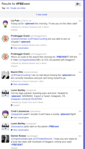
  3. Set up a twitter search for #PBEvent. Be prepared for a lot of tweets to flow past you. I know last year there was a lot of chatter during the sessions as people shared things they learned as well as discussing and expanding on points made. Just cherry pick things from the Twitter feed and you will gain ideas and inspiration is my (educated) guess.
    Twitter feed for #PBEvent

    Already #PBevent is trending on Twitter – tweets will fly over the Problogger conference weekend!

    There will also be related hashtags as each session will have its own – I guess the trending hashtags list will give us a clue on the day!

  4. Find out who is at PBEvent (many have announced that on Facebook, in their blog, etc) and keep an eye on their blog and social media feeds. A lot of valuable information and insight will be shared in the next week. And you can select bloggers from your industry to refine the information, too.
  5. Got some blogging friends or contacts who are in your area instead of the Gold Coast? Why not get together for an hour or two this weekend? Watch the social media feeds and discuss some of the ideas you read. Not as good as the main event but you can still get some camaraderie and new ideas – and maybe a laugh or two while you’re at it!
    Of course, making local blogging contacts can have a long lasting impact on your blogging, too.
  6. Look up posts and other resources from last year’s PBEvent (I listed some in posts here and here). I intend dong this before any recordings are available  – partly to pick up some of the excitement again but also to remind myself of what I learned last year and how it worked (or didn’t!) for me.
  7. Blog! If you can’t be with them, at least make that motivation to write some posts!
  8. Plan for next year. What stopped you going this year? If it was money, plan how you can raise that extra mony for 2014 (there is an affiliate session by Darren, a session on starting to monetise and a selling stuff session by Shayne Tulley to help, too!) If it was timing, can you schedule things differently for next year now so you can be at PBEvent?
  9. Give yourself thinking time over the weekend to consider your blog. Ask questions like why you blog, what is and isn’t working, are you reaching the right audience, is it worth adding more (or less) media to your blog, and how can you best measure the success of your blog.

[Tweet “Watch #PBEvent on Twitter this weekend to learn a LOT about blogging!”]


◊ Yes, this is an affiliate link. However, I suggest this because I know how great the event was last year. If I help cover my costs through an affiliate link, it helps my blog keep going and it doesn’t cost you anymore than if you bought a ticket directly. And it’s all done through Problogger so I never see any of your details.

Communications can win or lose votes

I don’t watch politics for fun. In fact, I don’t like politics very much at all and I often find their behaviour childish. Childish in a way I wouldn’t tolerate from any actual children…

Yet I am going to write a blog post inspired by a politician and Saturday’s election. It is mainly about their communications so no need to hide from another political statement!

Checking my options

Boat allowed to enter Australia

I am proud of Australia and am willing to welcome refugees.

Earlier this week, I went to a number of websites to find out more about the smaller parties. Namely because I can’t bring myself to vote for either major party this year – blocking refugees asking for help is simply wrong.

On each site, I looked at their policy ideas and details on their candidate in my area.

Learning from their websites

Based on reviewing a few sites covering the same basic idea (ie what the political party stands for and why we should vote for them), here are some useful website tips for us all:

  1. Summaries and simplicity are good.
    A short summary of each policy area with a link to greater details made one site much easier to read and quickly gave me an overview of the party. The lists of actual policies were also brief and to the point. It was therefore easy to decide whether or not I liked them.
    Other sites waffled on or gave me a long list of policies to choose from which was more intimidating than  a single-page summary.
  2. Dead links are frustrating and reduce your credibility.
    One site had my local candidate listed but every link on his name took me to an error page. Given I found the rest of the site a bit vague, I really wanted an impression of him to make a decision. Instead, I was frustrated and didn’t feel the party was very professional or reliable.
  3. Explain who you are fast.
    One site (and I spent very little time on their site once I started reading their offensive nonsense, so maybe there’s a reason for their web design!) had a huge banner and blog posts on the home page. It gave me no idea of who they were (not even that they are in fact a political party) which is what I wanted to know – their latest news is in the realm of politics I don’t care about!
    A clear tagline, an introduction or useful imagery can give information to site visitors quickly and makes life easier for people.
  4. Show information, or don’t – changing is annoying.
    I clicked through to an inner page which was basically a list of questions. Initially, I saw questions and answers but as I was part way through reading the start of one answer, it disappeared to show me a list of questions. Obviously, their software is set to narrow the content to just the questions but the loading time was so slow it showed answers first. Very frustrating to deal with as a site visitor.
    Have you checked how your clever settings actually work for site visitors? Often a simple solution works consistently so is better than a fancier option.
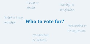
Choices about who to vote for - clarity, trust, briefness and more

What characteristics are important in choosing where to vote or spend your money?

Learning from the candidates

Remember how I couldn’t find information about my local candidate above? I found a media release about him and some others in his party which my local candidate had replied to in the comments.

There is both good and bad to be learned from those comments…

His first comment was long. Maybe a third of a page without paragraph breaks long (lack of structure may be due to the software, which is on the party not him, so I’ll give him a pass there!) It started with a lot of impressive words strung into a sentence or two that made absolutely no sense. Instantly I had no faith in him and no desire to vote for him.

The lesson – make sure anyone representing your business online can write reasonably well or do it for them. A genuine message is better than trying to impress readers.

However, I will give him credit for answering multiple people’s questions to the media release. Responding to comments and questions showed enthusiasm and passion, and listening to people is a precious commodity when it comes to politicians.

Yes, some of those answers were long winded and were nice ways of fobbing off hard questions but he was trying.

The lesson – respond to people online to build rapport, show your personality and gain another opportunity to explain your purpose or skills. Remember, people may see this rather than your carefully crafted profile – especially if a link is faulty!

What have you learned from this election?

Have you come across examples where a politician or political party has communicated well or poorly?

Maybe some of the above examples have inspired you to check your own website with a different perspective. If so, I’d love to hear about it in the comments below…

While I am not going to vote for a party just because they did the best job with their website, being able to easily understand the party does influence my choices.

Just like as a business owner or consumer I am not going to buy something just because you have the prettiest website, but I am more likely to trust you (and thus give you my money!) if your site is professional, simple to use and inoffensive.

But based purely on my descriptions of their websites, who would you vote for from the above examples?

Personally the first site I mentioned would get my vote – their summaries and easy-to-navigate site made it easy.

What do you know about blogging?

On one hand, blogging is simple – put some words into a blogging platform and publish them. Make them good words and you’ll get lots of readers.

On the other hand, there is a lot of skill, strategy and knowledge that goes into running a good blog. And a lot of different measures for deciding if a blog is successful, or not.

leanring ABC of blogging

There is a lot to learn about blogging – but the important aspects are already with you

So what do you know about blogging?

What do you want to know about blogging?

Do you know why you care about blogging?

This isn’t a trick question I can give you an answer to.

I do think it is important to know why you are blogging (or thinking of blogging).

If you know why, you can make your blog suit that purpose and you have something to measure your success against.

For instance, if your aim is to build awareness of topic X, you can decide if 10 targeted readers is enough or if you need thousands of readers a week. Whereas if your aim is to blog to build  a habit of writing 200 words a day, a look at your post dates is an easy measure of your success.

I recently read a post by Rhianna which lists what she knows about blogging. It isn’t a technical list of how long posts should be, the best post frequency or choosing great titles, but a more basic list of what she knows about herself and her blogging purpose.

Like the Cheshire Cat said, how will you ever know you have arrived if you don’t know where you are going?

In a business context, I think this becomes even more important as time blogging could be spent elsewhere for perhaps greater profit – how do you know the blog is ‘working’ and worth the effort if you don’t know what it is meant to achieve for your business?

Even if you hire someone like me to help write or edit your blog posts, you need to know the purpose of your blog to assess it’s worth. And give direction to the writer.

So in the comments below, let me know why you blog. Or put in your ideas of maybe why you blog to help form your final answer and see if that changes how you blog.

* Images courtesy of 123rf

Ads disguised as information is lose-lose

For myself and for clients, I have often had an editor question whether I will provide an editorial (or article) rather than an advertorial. It’s almost insulting.

brand resting on trust

Brand rests on trust.
Dressing ads as information is not building trust.

Editorials are often the expectation

I say almost because I understand why an editor wants that reassurance.

It’s insulting because I wouldn’t ever pass an advertorial off as an article. I just wouldn’t. It is unprofessional for one thing and I would hate it as a reader so don’t do it as a writer/publisher.

Silly, I know, but I also assume others would not offer an article or editorial when planning to provide an advertorial.

This week, I was shown my silliness in believing that.

I read a guest post on a blog to find it was part advertorial. And the first part was advertorial to make it worse.

It flavoured how I felt about the post as I read the rest of it – I was suspicious because I was just waiting for the next sell instead of the next piece of information.

How was it an advertorial?

Let’s use this guest post as an example of advertorial.

It was a bullet list of tips related to a service offered by the guest poster. The topic and introduction did their job, bullet point one was a very generic statement without explanation.

The second bullet point was a sales pitch. “[This] is paramount. If you haven’t done it, I would be happy to help you”

It did not teach me anything, nor entertain.

A subsequent point included her business. Using your own business in examples is fine, and can be an effective way to put your name into an article. However, she did it as an explanation, not an example. And included a boast about her success in that area.

It probably would have come off as a clumsy example if the earlier point hadn’t been blatantly promoting her services.

In short, an advertorial is an ad disguised as an informative article.

What makes an article an article?

A good article (or editorial or technical piece or whatever name a particular site or magazine calls it) is basically the sort of article you want to read.

It will

  1. provide real information or entertainment, maybe both
  2. not overtly promote any business, person or product. It may promote an industry, service or type of product. So I could write about the value of using a professional writer but not directly write about my writing services.
  3. be accurate and correct, although it may be biased in one direction
  4. be written to the writer’s best abilities – and possibly better if the business gets it written or edited for them
  5. build trust and loyalty


It’s what I aim at in every blog post and article I write – I want to help people write and communicate well.

Is it the sort of writing you prefer to read?

Do you ever read an entire advertorial?


Simplify online forms for everyone’s sake

Filling in the account details on a website form today I was reminded of how difficult things can be when someone assumes knowledge.

Yes, we all KNOW that if you assume you make an ass out of u and me. But that doesn’t stop many of us making assumptions that we shouldn’t.

And I suspect that online forms is one area where people just get a form put together quickly without really thinking about making the form easy to use and highly effective.

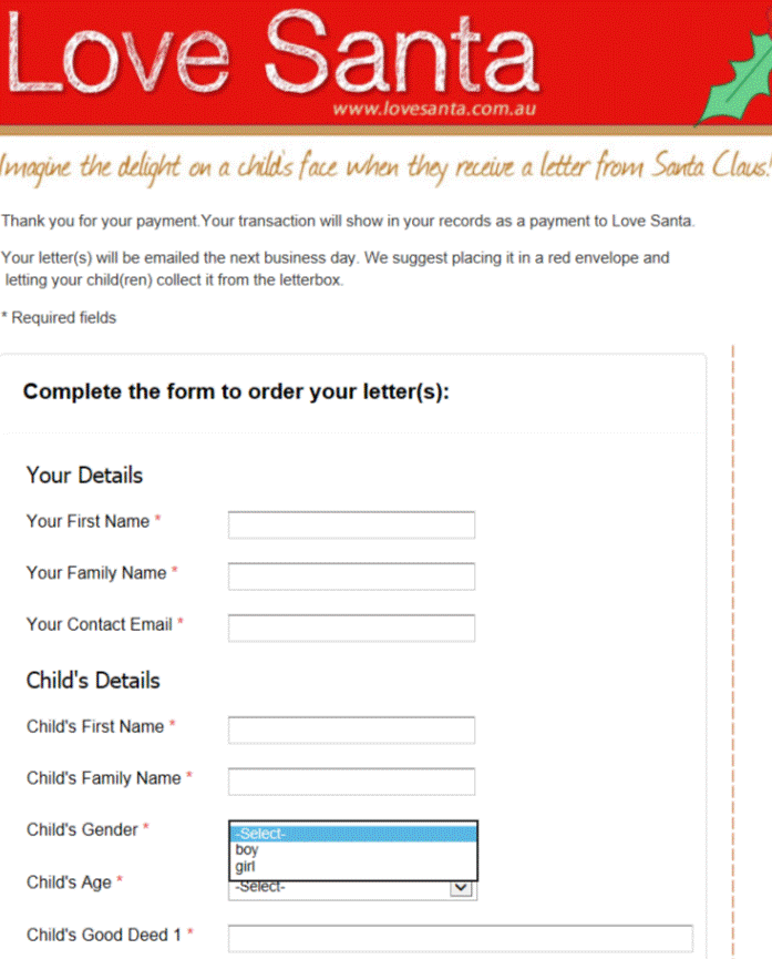
Excerpt of an online order from on Love Santa's website

Simple text, plenty of white space and provided options make a form much easier to fill in.

Contact forms need to be simple to use

Today, I was faced with two boxes under the title ‘Your name’.

So I had to figure out if they wanted Tash then Hughes or Hughes then Tash, or maybe Tash Hughes and the second box shouldn’t have been there at all.

It was obvious to the person creating the form what they wanted, but not so obvious to me, the paying client.

With just a little more effort on their part, the form could have been better labelled or set out and thus been much simpler to use.

Complex and unclear forms lose sales

I reread a blog post recently that gave a perfect example of how a simple form impressed a potential client – and a vague form (that was also hard to find) turned that client away from the business.

A poor form can be that serious – people may not be patient enough to work through the issues so you could lose a customer. And possibly earn some bad comments elsewhere.

Making your forms simple

There are many ways to simplify a form, whether it is an order form, contact form or an online survey/feedback form. And what works with one form may not work well with a different form, so there is no simple answer for making your forms effective.

However, here are some generic tips to help you keep your forms simple:

  1.  think about what information you really need to meet the purpose of the form THEN write the questions to gather that information. And decide which of those answers is a must-have, and which can be optional
  2. think about who is going to use your form then choose wording and question styles to suit them as much as possible
  3. use one label per box*
  4. provide options to choose, rather than text boxes, where possible. So a street or suburb field needs to be empty but you can give a choice of states
  5. in a select an answer question, don’t give more options than necessary – if your provided answers don’t cover all possibilities, add ‘other’ or ‘custom’ as your final option
  6. reduce clutter around the page
  7. use clear wording to explain what you expect in each field
  8. use consistent wording. For example, if the first field is ‘your name’ make sure the next field is ‘your address’ not ‘my address’
  9. make the final button obvious – both in placement and size but also in the text you use. It is more effective to have a button that says ‘place order’, ‘send message’ or ‘request quote’ than plain old ‘submit’ – just like the ‘tweet’ button on Twitter and ‘publish’ button in WordPress.

Got any questions about making your forms simpler and effective? Why not ask below as a comment, or send me an email?

* If you are using a form with one box per letter (usually only for printed forms), this tip becomes use one label per obvious group of boxes.

Image of form courtesy of Love Santa

Developing your eBook writing skills

hands holding an electronic reader to view an eBook

Creating an eBook may be easier than printing a hard-copy book, but it still takes effort and skill to make it a good eBook.

Writing an eBook appeals to many people, but not so many have done it. Is it something you have been thinking of doing?

The following eBook tips come from a ProBlogger webinar I participated in at the end of July. They look short and simple but there is a wealth of information there if you take the time to think about them.


  1. Always add value to your readers, whether it is information, instruction or entertainment. Without value, it will not good and is not likely to get much word of mouth promotion nor good reviews. This has to be the basis of any eBook you write – just like it is the basis of good blogs posts and articles.
    [Tweet “The best basis for any eBook is adding value to your (potential) readers.”]
  2. A blog can be a great testing ground for your eBook ideas.
  3. Choose an eBook topic on what could sell AND what you can actually write about! In other words, balance your skills against your readers’ needs
  4. An outline for an eBook can help designers start before content is complete – a time efficient option!
  5. In writing the solution to a problem, make sure it is a problem people recognise as a problem. For example, people buy a book on travel photography by perhaps not one in taking colour photos even though it is a basic skill and component of travel photography.
    ‘When writing an e-book, try to write about something with tangible results i.e. Take Better Travel Photos’ by Bright Fox Media
  6. make sure your topic has enough content to last – an eBook is longer than a blog post or magazine article remember!
  7. republishing existing  blog content is fine, especially if it is reorganised and updated.
  8. do a plan or outline of your eBook
    1. it is a good starting point for writing your eBook
    2. it provides a structure that stands no matter what order you write the content in
    3. enables planning your launch and content that can be used to generate interest (eg guest blog posts, social media updates)

What challenges have you faced when thinking about, planning or writing an eBook?


How businesses can use templates

So I’ve posted about poor template use and given some tips on maximising your use of templates.

But maybe you’re wondering what sorts of templates you could use in the first place. Or whether it is worth the effort to prepare a template.

What are templates for?

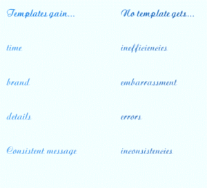
Advanatges of using templates - and diadvnaatges of not using templates

Templates have so much to offer a business…

Templates are great for

  1. saving time as you don’t have to start a document from scratch each time you use it. This applies to commonly used documents (so you save time regularly) and infrequently used documents (so you don’t have to search for the ‘last time you did something like this’ to find the details).
  2. ensuring consistency over time and between staff members. A template means everyone says the same thing so there is no confusion.
  3. building your brand through consistency in style as well as consistency in the actual message. Imagine one staff member writes formal letters while another writes casual letters in the same circumstances – a template means both use the same style.
  4. ensuring all important details are included. In the rush of everyday, it is easy to write something and forget a particular detail; a carefully prepared template will have those details (either in full or as a field for you to enter the correct information)

So, what templates can we use?

Ok, that’s as easy as answering ‘what letters can we use in our business?’

There are many different things that can be put into a template for improved efficiency and branding. So this list is a sample to get you thinking of what can be changed in your business.

  1. one-off use of major business document templates like a style guide, marketing plan, business plan and personnel manuals. (Note by one-off I mean the template is generally used once but the document itself is updated periodically).
  2. regularly used documents such as sales letters, enquiry letters/emails, welcome letters, overdue accounts notices
  3. briefs for suppliers such as writers, designers, programmers
  4. an outline template for items such as blog posts, management reports and media releases
  5. general stationery can be set up as templates – for example, a letterhead can have the date/name/address/greeting fields prepared and a prepared minutes format can make reporting on meetings much easier
  6. technical and/or legal documents such as terms and conditions for competitions, customer contracts and instruction manuals/guides.

What other templates have you used that have made your business life a bit simpler and easier?

Making templates earn their keep – not as hard as you may think

Using a template can be a great tool – it saves time, ensures important details are included and builds consistency.

Maximising your templates

But for best results, each use of a template needs to be tailored to the purpose. Just copying it as is looks lazy and can lead to embarrassing mistakes.

That means, if you use a template…

  1. change all the variable fields (business name, dates, prize value and so on)
  2. check the text surrounding the variable fields to ensure things make sense (for instance, a template may use singular verbs but you need plural verbs)
  3. read the entire document from start to finish looking for
    1. irrelevant points
    2. contradictions and inconsistencies
    3. deviations from your style guide

Template tips

My advice for templates is to always start with the base document.

Samples of templates to show variabel text can be presented in different ways

There are various ways to indicate variable text in a template – colour, xxx, brackets, choices…

So if you have a template for competition terms, always use the original template rather than taking last month’s terms and updating them.

It is so easy to miss one field if you update an existing document, leaving a mistake that at best makes you look silly and at worst could have legal or customer service issues for you.

If you find that you are adjusting a lot of the common text, create a new version of the base template to use.

If you find you are often changing text around certain fields, make some of that text variable, too. It doesn’t have to be a blank space, you can provide two alternative sets of words (eg ‘All winners are’ or ‘the winner is’) as part of the template.

A template should be a ‘living document’ in that it is regularly reviewed and adjusted for each use. The first version can be useful but by using it, improvements often become apparent as it is used in different situations.

For documents with very sensitive content (such as legal implications) or to be used by many people of varying skills, consider setting up the document so non-variable text can’t be edited.

Do you have any other suggestions for maximising the use of templates in business?