Welcome!

I hope you find my writing and business tips and observations useful. My business and blog are dedicated to helping businesses communicate clearly and reach their potential. Read, subscribe to my newsletter, enjoy!Tash

Refer to older posts…

Blogging services

HCI chat

Make your website more accessible

Following on from the Canadian court case and why accessible websites are a good objective, it’s time to share idea on how to make site accessible.

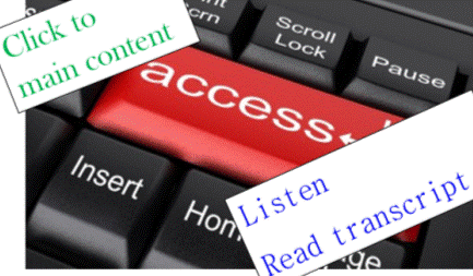
Principles of accessible websitesAdd access to keyboards and internet

According to WebAIM (Web accessibility in mind), the key aspects of an accessible site are:

  1. appropriate alternative text (ie alt tags for images and graphics)
  2. headings for data tables (ie appropriate table headers in the code, using <th>, not just titles in columns and rows)
  3. ensure forms have labels for every field (ie use
  4. use meaningful text for links so they can be used out of context (ie don’t use ‘click here’ and ‘read more’)
  5. add captions and transcripts for audio materials (including videos)
  6. make attachments (eg a pdf, doc or Powerpoint document) accessible too or convert them into an html format
  7. enable people to skip repeated content (such as navigation menus that are on every page)
  8. don’t rely on colour or font changes to convey meaning
  9. make content clear and easy to read
  10. be careful with the use of JavaScript – make it usable without a mouse and make pages work without JavaScript
  11. design to w3c standards – CSS sheets help readers separate out presentation details from the content; html pages are easier and actually more SEO effective

 Following these principles

Making your website accessible makes sense.

The principles are fairly simple and non-expensive to follow. I know I adhere strongly to some of them – and others I just didn’t know or think about. And some aren’t so relevant (for instance, I don’t use JavaScript on my site).

Which of these principles do you follow all the time? Which did you not realise were possible or an issue?

I know it will take me a bit of time, but I am going to work my way through that list (well, the ones I haven’t done in the past) so I can learn how they work and implement them. Starting with form labels and table headers as I didn’t know these existed before now.

As I learn more, I will share that knowledge – the more awareness we share, the more we can make the internet accessible and inclusive. Will you help make it so?


Why should your website be more accessible?

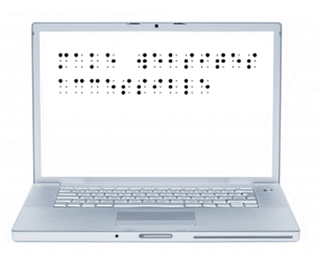
braille message on laptop

‘make websites accessible’ in braille

Why wouldn’t we want to make our website accessible to all sorts of people, including people with limited abilities (such as visually or hearing impaired people)?

I read yesterday that a court case in the USA is showing that many sites are not easily accessible to the disabled (visually impaired people on this specific case) and may actually be breaking the law by excluding accessibility considerations. Legal aspects of accessibility I know nothing about, but morally and from a business perspective, I know an accessible site is a good aim.

Why make your site accessible?

Well, why not really?

The obvious answer is that the more accessible your site is, the more people can visit it and so you increase your sales or influence by having a bigger audience. Making it accessible also builds trust and credibility for you and your brand.

Also obvious is that you are welcoming all people and being a decent human being to not make life harder for certain groups.

Would you build a cafe and not have a ramp for wheelchairs/prams or refuse to describe your menu to someone who couldn’t read it? Of course not, so why not do the same with a website?

Computers can do many things these days, so don’t assume a blind person can’t read websites so doesn’t go online. There are tools that read webpages to the blind. There are anti-spam tools that rely on audio for those who can’t read the captcha images. Text on websites can be expanded to be seen by those with limited vision.

And so on.

For someone who finds it difficult to hold a book or turn pages of a magazine, how much easier is it to move a mouse and read on a screen? Or use a verbal command to flick between webpages?

Just like a computer reading a webpage is easier than getting someone to read to you if you have limited vision.

Or a website offering written transcripts of speeches and presentations enabling the deaf to know what’s going on.

Or being able to search for a website that offers an understandable version of something for anyone with intellectual disabilities.

We can make life easier for peopleopen doors to welcome the disabled

The internet has opened so many doors for us as a society.

As website owners/managers, we can open those doors further by making our websites accessible to the disabled.

I have long added alt tags to images, for example, so a visually impaired person can be told what the image is about.

There are other things that are easily done that I wasn’t aware of. Now I am aware, I will start implementing them.

My next post will list some of the ways we can make our sites more accessible.

But what do you do on your website(s) to make it W3C compatible and accessible? Why do you make it accessible, even to a small extent?

Making procedure manuals accessible

manaul stored as a folder

How many picture a 'manual'

Looking back at what I’ve written in previous June, I came across a post from 2011 about making manuals less intimidatingand therefore simpler to use.

A manual or instruction guide is just a collection of procedures. If each procedure is written well, they are useful documents to have in any business.

Once people are used to having good procedures to follow, it is a simple step to make manuals accessible rather than intimidating and officious.

Manuals can be presented in many ways

Even to me, the word manual conjures up images of big heavy folders, covered in dust, and difficult to use.

There is no need for all your procedures to be kept in a heavy (or light!) folder. Make it more accessible with any or all of the following ideas:

  1. put individual procedures where they are used. So the procedure for how to use a piece of equipment is stuck on the wall near that piece of equipment or inside it’s case if the equipment is portable
  2. make the procedures available in soft copy in a series of folders – looking in an electronic folder is something most people are now used to while hyperlinks and search functions make it even easier to find the right procedure
  3. for procedures you do need to print out, put only related procedures in each folder so they can be stored where needed and handled with ease
  4. think about other ways to have all procedures (and perhaps your policies as well) together. Maybe a tablet or e-reader would be more useful in your situation – there is a search function, version control is easy and the collection is light to carry around and use

What creative ways can you think of for presenting procedures in your business?

Agreeably in accord

Constantly confused by letters and similar sounding words? Then read on, learn new definitions and relax!

consonance [noun]: agreement or harmony of the parts of a whole; the repetition of consonants, usually for the key syllables of words or in key words of the writing – often used in poetry
Consonance of words, tone and meaning makes good writing better.
Click-clack, click-clack, the train runs along the track. {note the repeated ck sound)

consonants [noun ]: letters other than vowels ( so not a, e, i, o or u) – more technically, these are the letters which require at least partial closing your vocal tract to say them.
There are 21 consonants in the English language, although Y can act as a vowel and W acts as a vowel in Welsh.

consonant [adjective]: in harmony or agreement
Consonant with the company’s brand, the salesman promised quickly delivery

Is your business prepared for 2012-13?

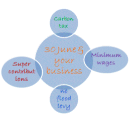
changes for 1 July 2012With one week to go in this financial year, I thought it a good time to remind you of some changes that come into effect on 1 July.

  • the carbon tax starts – find out more about pricing impacts on the ACCC website
  • minimum weekly wages increase by 2.9% so if you employ anyone at minimum rates (including apprentices, trainees and juniors) make sure you are meeting the Fair Work Australia requirements
  • new individual PAYG tax rates change – namely the tax-free threshold is increasingly significantly. Make sure your payroll software has been updated with the new rates before your first pay run
  • the flood levy finishes on 30 June so if you have been deducting this from employees’ pays, remember to stop!
  • the superannuation co-contribution rate is halving to $0.50 per $1 you contribute, so if you qualify this year, you have a few days left to make a personal contribution to get this
  • concessional superannuation contributions (those from your employer, salary sacrifice or that you claim a tax deduction on) will be capped at $25,000 regardless of your age or situation. Check your contribution rates for 2012-13 so you don’t get any nasty tax surprises…


Have you implemented all of the relevant changes for your business?

If you’re looking for some tips for the end of financial year, some of my previous posts may help:

Preparing for the end of financial year
Maximise your 30 June position
Keeping your accounting issues under control
Understanding profit and paying yourself

Develop a simple internet marketing strategy

Last week, I participated in a webinar by Gihan Perera, author of Fast, flat and free: how the internet has changed your business.

There were two things from the webinar that I wanted to share (as well as all the  tips I tweeted during the webinar!) – the first being the basic aspects of an internet marketing strategy:

  1. create
    in other words, get a website and get online! Be it a static one page site, a blog or a fully interactive site with hundreds of pages, until you have a site it’s hard to market online
  2. generate
    write some content – preferably good content and lots of it. Put content onto your website and/or blog plus in a newsletter, webinars, podcasts and on sites like YouTube, Pinterest and Slideshare
  3. share
    let people know about your content, with the key method being social media links. Gihan suggested automating this as much as possible to save time and ensure it is done, and I agree
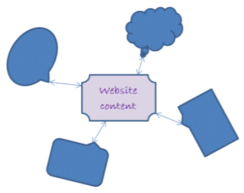
  4. participateGenerate conversations with website content
    get online and join in conversations! So visit other websites and comment in blogs, add reviews, join forums, respond on Facebook, tweet and retweet, answer LinkedIn questions, share interesting things and so on. This step is necessary to engage with other people and should take a large proportion of your marketing time


When you think of it as four simple steps like this it is a lot less intimidating and a lot more achievable, don’t you think? And it is realistic to think of it this simply rather than worrying  about a big picture that overwhelms you.

I also like the priority of generating content before you get caught up in marketing and building links – I honestly don’t think you can build a strong foundation online until you have decent content that people will want to use – and share.

So now’s your chance – add a comment to this post to boost your internet marketing and share you ideas. It’s easy, I’ll answer you and you will get a ‘dofollow’ back link so – what do you think of Gihan’s internet marketing plan?

Is anything worse than doing your worst?

unclear worse worst

Get clear about what is worst!

With only one letter difference, today’s words are related but subtly different – and just sound wrong when used in the wrong context. Thanks to Entrapment’s comment a week or so ago, here are my definitions of worse and worst.

Note that both of these words can be used as an adverb, adjective or noun (and worst can also be a verb) so I have given all definitions.


worse:
[adjective] of a lower quality or standard The sight was terrible, and the smell worse!
[noun] more unfavourable or desirable Worse was yet to come!
[adverb] showing less skill or ability She had worse handwriting than you!

worst:
[adjective] the lowest quality or standard The hotel last night had the worst service.
[noun] the most unfavourable or desirable He was yet to face the worst.
[adverb] the most adversely or severely Marytown was the worst affected in the fires.
[verb] completely or thoroughly defeat He came out of that the worst.

The key difference to remember is that worse is poor while worst is the poorest possible. For instance, the flu is worse than a cold but pneumonia is the worst of the three.

Just to twist things a little, do you often think about the worst parts of your business, or concentrate on the best?

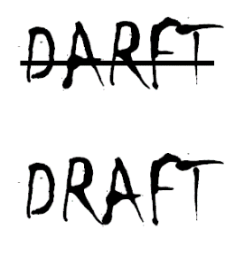
Effective content starts with a draft

Good content starts as an idea that is drafted onto paper or screen and gets developed through editing and revisions.

I once had a conversation with another business person we’ll call Mel:

Tash: Just get the ideas onto the page. It doesn’t matter about spelling, grammar, proper sentences or even the order. Just get things down to get started – it’s the best cure to writer’s block or procrastination.”

Mel: {laughs} Just don’t tell YOUR clients that’s what you do!

Sometime later, I am still wondering about why Mel said that.

checking draft spellingAdmittedly, not many of my first drafts are that rough (I spell and use grammar instinctively so even drafts read ok) but that’s not the point.

There is nothing wrong with a first (or twentieth if need be!) draft, nor with a first draft being an awful mess. No one else would ever see a rough first draft but it serves a purpose to why not admit to creating rough drafts?

I don’t expect a designer to instantly produce me a perfect web page or eBook layout – I know I’ll see drafts so I can confirm what I do and don’t like to get a finished product that suits my need.

I don’t think any writing client would be upset that I have drafts – it helps them get a better final result. And if they’re paying for the finished wording, they really don’t care how many drafts it takes me!

Do you relate to what Mel said? Would you hide the fact you started with a rough draft in order to produce something professionally?

Understand your blog hosting options

jion the blogging worldOnce people decide to add a business blog, they sometimes ask me about hosting the blog.

There are two basic options for having a your blog hosted – hosted by the blog software people or hosting you arrange yourself.

Hosting your own blog

Putting the blog software onto your own domain and web hosting is the better business option in my opinion. Yes, it does cost more but the advantages are worth paying that price.

So what are these valuable advantages?

  1. it is on your domain so you get a simple URL to promote, matching email addresses and a full website to do other things as well as run your blog.
    Yes, some hosted blogs now allow you to map a domain so it looks like your blog is on a domain (so you get the simple domain) and it can be cheaper than actually hosting it yourself.
  2. Control your blog & risk

    Keep control and reduce risk to your blog

    you have long-term control – if you own the domain and hosting, no one can change the rules. True, blogging platforms haven’t done much of this in the past but the possibility is there

  3. you set the rules – it is your site so you can do things your way. For example, hosted platforms generally won’t let you do much to monetise your blog but you can add Adsense and affiliate links throughout any blog you host
  4. no one else has back-end access to your site/blog so you know that the content remains yours
  5. you can choose the look and functionality of your blog. Hosted platforms offer some choice of templates, designs and plugins but if you host it yourself you have many more options.
    A wider scope of templates and style adjustments means you can make your blog look the way you want and, most importantly, unlike any other blogs.

Getting a hosted blog

Although I think hosting it yourself is a good move, getting a hosted blog does have some advantages, too:

  1. it is free – obviously a good incentive for any business!
  2. there’s nothing to install or update – you just open an account and the rest is done for you (well, the rest of the backend stuff – you still have to write the posts!)
  3. the host provides a certain amount of traffic by virtue of their domain and they usually have lists of recent and top posts somewhere on their site. Of course, traffic you generate also helps the host so it’s win win (to some level anyway!)


So that’s my view of your options – do you have any other advantages for either option that I’ve missed?

Next week, I’ll write about the actual choosing between these options – if you have any questions, let me know!

* Photo courtesy of 123rf

Train the child’s flesh

Clear writing is important for getting your message across, and often to help you make sales.

A poor message won’t attract as many sales nor earn respect or trust so it is worth getting help if you struggle writing clearly.

As a very clear example of this, I wanted to share the information on the back of a jigsaw puzzle box aimed at 3 year olds.

Give parents’ word:

In childhood there are per 80, the  growth of human’s brain. At period the learning and attraction is  most strongest in a life. So the parents pay attention to train your children.

Clever is not inborn, it’s gestated in the circumstance of growth. If the parents can choose more toys, that it can guide their hand and brain with together. Not only it trains their dexterity hands in the iteration, but also coordination function their brain, eyes and hands, It will breed a clever, health child.

Introduction of function:

Play the  number train, it can train acquaintance and memory to color, material and English word, and enhance recognition to sight and total concept.

Play the number train, Must according to the order of the number, Then patch a intact number train, So it can advance the growth of child’s flesh and raising the custom of hand.

child's toy trainOn the positive side, if it was web content, the word train was a good choice – it both represents the image on the jigsaw and the idea of training or teaching so is a great keyword for them.

Beyond that, I’m struggling to find much positive about this example of writing! Although to be fair everything is spelt correctly! I’m not going to list all the errors, either, as it would become a very long post if I tried, lol.

Obviously English is their second language but if you’re selling to English markets it is worth getting someone who truly knows English to check your work first.

Luckily, I didn’t need any instructions to do a jigsaw but imagine if I had needed their instructions…