Welcome!

I hope you find my writing and business tips and observations useful. My business and blog are dedicated to helping businesses communicate clearly and reach their potential. Read, subscribe to my newsletter, enjoy!Tash

Refer to older posts…

Blogging services

HCI chat

Business Communications

Writing annual reports and attachments as one

So you have decided to have an annual report and a couple of inclusions that will be sent out with the annual report.

Task list for annual mailing

An annual report and any inclusions all form one annual mailing project.

Does this equate to three separate projects, or three parts to one project?

It is a good question, and I can see a temptation to treat them as two or there projects. Maybe you outsource the big project (the annual report) but figure you can manage the smaller ones yourself. or maybe you want to outsource to different people so the inclusions don’t distract from the annual report and vice versa.

However, I consider them to be aspects of one project and like the idea of them being managed as such. I usually mange the inclusions along with annual reports for clients, even if it is just a review and feedback on an existing document.

why consider them as a single project

Treating the annual report and any inclusions as one project works because

  • they  all need to be prepared by the same deadline and delivered to the same place for processing and mailing
  • the various elements of the annual report mailing are linked (as they are received in same envelope) so you want consistency and to them to complement each other which is much harder to manage if created independently of each other. Even if all match the style guide, any themes and layout options may not quite fit together
  • in terms of time management, I find I can work on one piece while another is with the designer or being reviewed by my client
  • any images can be managed so they are only used once or duplicated in every item (as best suits the situation)
  • it is easier to make references between the items. For instance, the annual report may state ‘we’re launching a new product – to find out the prices, see the enclosed flyer’. This is riskier when you can’t be sure what the other items actually include – if the flyer doesn’t include prices, the annual report reference looks silly.

Have you ever separated the annual report preparation from the inclusions preparation?  I’d love to hear your reasons and the results of your effort, so please add your experiences in the comments below!

Answer customer questions

Even the negative ones.

If a customer has a question, they want you to answer it – and preferably as soon as possible so they can move on to the next step.

answering questions leads to customers

Answer potential customer questions to get more customers

Look at your website, brochures, social media profiles and other written messages – do you answer customer questions?

Smaller documents can only answer a few questions, obviously, but make them important questions (like how to contact you for further answers!)

Scary questions

Some businesses are scared of people asking a certain question – or act that way anyway.

Why not stand out by being the brave business? It is honest and gives customers fewer things to worry about because you have answered their questions.

And it gives you a chance to make things more positive, too.

So a dentist website can include “will it hurt? Well, yes it might but we’ll warn you and do whatever we can to minimise it.”

Here are some more industry specific examples…

  •  personal trainers: ‘do I really have to work out in between visits?’ ‘Only if you want the best results!”
  • accountants: ‘am I going to have to dig out all my old receipts?’ ‘I’m afraid so – the more receipts we get, the more we may be able to get back for you at tax time!’
  • editors: ‘will you really point out all my spelling mistakes?’ ‘Yes, that’s what you’re paying us for – but we promise not to make you feel bad about any of them!’
  • online shops: ‘do you charge postage and delivery?’ ‘Yes we do. We decided to charge official postage rates rather than increase the prices of everything to cover delivery.’

Do you answer any potentially negative questions in your materials? How have clients responded to those answers?

If you want some ideas on what questions customers may silently being asking – and how to answer them nicely – then contact me soon so we can help your customers find what they need.

Communications can win or lose votes

I don’t watch politics for fun. In fact, I don’t like politics very much at all and I often find their behaviour childish. Childish in a way I wouldn’t tolerate from any actual children…

Yet I am going to write a blog post inspired by a politician and Saturday’s election. It is mainly about their communications so no need to hide from another political statement!

Checking my options

Boat allowed to enter Australia

I am proud of Australia and am willing to welcome refugees.

Earlier this week, I went to a number of websites to find out more about the smaller parties. Namely because I can’t bring myself to vote for either major party this year – blocking refugees asking for help is simply wrong.

On each site, I looked at their policy ideas and details on their candidate in my area.

Learning from their websites

Based on reviewing a few sites covering the same basic idea (ie what the political party stands for and why we should vote for them), here are some useful website tips for us all:

  1. Summaries and simplicity are good.
    A short summary of each policy area with a link to greater details made one site much easier to read and quickly gave me an overview of the party. The lists of actual policies were also brief and to the point. It was therefore easy to decide whether or not I liked them.
    Other sites waffled on or gave me a long list of policies to choose from which was more intimidating than  a single-page summary.
  2. Dead links are frustrating and reduce your credibility.
    One site had my local candidate listed but every link on his name took me to an error page. Given I found the rest of the site a bit vague, I really wanted an impression of him to make a decision. Instead, I was frustrated and didn’t feel the party was very professional or reliable.
  3. Explain who you are fast.
    One site (and I spent very little time on their site once I started reading their offensive nonsense, so maybe there’s a reason for their web design!) had a huge banner and blog posts on the home page. It gave me no idea of who they were (not even that they are in fact a political party) which is what I wanted to know – their latest news is in the realm of politics I don’t care about!
    A clear tagline, an introduction or useful imagery can give information to site visitors quickly and makes life easier for people.
  4. Show information, or don’t – changing is annoying.
    I clicked through to an inner page which was basically a list of questions. Initially, I saw questions and answers but as I was part way through reading the start of one answer, it disappeared to show me a list of questions. Obviously, their software is set to narrow the content to just the questions but the loading time was so slow it showed answers first. Very frustrating to deal with as a site visitor.
    Have you checked how your clever settings actually work for site visitors? Often a simple solution works consistently so is better than a fancier option.
Choices about who to vote for - clarity, trust, briefness and more

What characteristics are important in choosing where to vote or spend your money?

Learning from the candidates

Remember how I couldn’t find information about my local candidate above? I found a media release about him and some others in his party which my local candidate had replied to in the comments.

There is both good and bad to be learned from those comments…

His first comment was long. Maybe a third of a page without paragraph breaks long (lack of structure may be due to the software, which is on the party not him, so I’ll give him a pass there!) It started with a lot of impressive words strung into a sentence or two that made absolutely no sense. Instantly I had no faith in him and no desire to vote for him.

The lesson – make sure anyone representing your business online can write reasonably well or do it for them. A genuine message is better than trying to impress readers.

However, I will give him credit for answering multiple people’s questions to the media release. Responding to comments and questions showed enthusiasm and passion, and listening to people is a precious commodity when it comes to politicians.

Yes, some of those answers were long winded and were nice ways of fobbing off hard questions but he was trying.

The lesson – respond to people online to build rapport, show your personality and gain another opportunity to explain your purpose or skills. Remember, people may see this rather than your carefully crafted profile – especially if a link is faulty!

What have you learned from this election?

Have you come across examples where a politician or political party has communicated well or poorly?

Maybe some of the above examples have inspired you to check your own website with a different perspective. If so, I’d love to hear about it in the comments below…

While I am not going to vote for a party just because they did the best job with their website, being able to easily understand the party does influence my choices.

Just like as a business owner or consumer I am not going to buy something just because you have the prettiest website, but I am more likely to trust you (and thus give you my money!) if your site is professional, simple to use and inoffensive.

But based purely on my descriptions of their websites, who would you vote for from the above examples?

Personally the first site I mentioned would get my vote – their summaries and easy-to-navigate site made it easy.

Ads disguised as information is lose-lose

For myself and for clients, I have often had an editor question whether I will provide an editorial (or article) rather than an advertorial. It’s almost insulting.

brand resting on trust

Brand rests on trust.
Dressing ads as information is not building trust.

Editorials are often the expectation

I say almost because I understand why an editor wants that reassurance.

It’s insulting because I wouldn’t ever pass an advertorial off as an article. I just wouldn’t. It is unprofessional for one thing and I would hate it as a reader so don’t do it as a writer/publisher.

Silly, I know, but I also assume others would not offer an article or editorial when planning to provide an advertorial.

This week, I was shown my silliness in believing that.

I read a guest post on a blog to find it was part advertorial. And the first part was advertorial to make it worse.

It flavoured how I felt about the post as I read the rest of it – I was suspicious because I was just waiting for the next sell instead of the next piece of information.

How was it an advertorial?

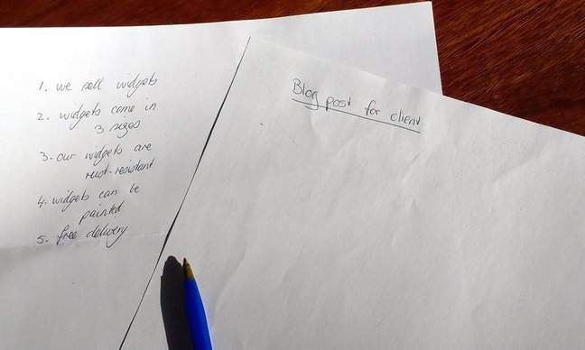
Let’s use this guest post as an example of advertorial.

It was a bullet list of tips related to a service offered by the guest poster. The topic and introduction did their job, bullet point one was a very generic statement without explanation.

The second bullet point was a sales pitch. “[This] is paramount. If you haven’t done it, I would be happy to help you”

It did not teach me anything, nor entertain.

A subsequent point included her business. Using your own business in examples is fine, and can be an effective way to put your name into an article. However, she did it as an explanation, not an example. And included a boast about her success in that area.

It probably would have come off as a clumsy example if the earlier point hadn’t been blatantly promoting her services.

In short, an advertorial is an ad disguised as an informative article.

What makes an article an article?

A good article (or editorial or technical piece or whatever name a particular site or magazine calls it) is basically the sort of article you want to read.

It will

  1. provide real information or entertainment, maybe both
  2. not overtly promote any business, person or product. It may promote an industry, service or type of product. So I could write about the value of using a professional writer but not directly write about my writing services.
  3. be accurate and correct, although it may be biased in one direction
  4. be written to the writer’s best abilities – and possibly better if the business gets it written or edited for them
  5. build trust and loyalty


It’s what I aim at in every blog post and article I write – I want to help people write and communicate well.

Is it the sort of writing you prefer to read?

Do you ever read an entire advertorial?


Simplify online forms for everyone’s sake

Filling in the account details on a website form today I was reminded of how difficult things can be when someone assumes knowledge.

Yes, we all KNOW that if you assume you make an ass out of u and me. But that doesn’t stop many of us making assumptions that we shouldn’t.

And I suspect that online forms is one area where people just get a form put together quickly without really thinking about making the form easy to use and highly effective.

Excerpt of an online order from on Love Santa's website

Simple text, plenty of white space and provided options make a form much easier to fill in.

Contact forms need to be simple to use

Today, I was faced with two boxes under the title ‘Your name’.

So I had to figure out if they wanted Tash then Hughes or Hughes then Tash, or maybe Tash Hughes and the second box shouldn’t have been there at all.

It was obvious to the person creating the form what they wanted, but not so obvious to me, the paying client.

With just a little more effort on their part, the form could have been better labelled or set out and thus been much simpler to use.

Complex and unclear forms lose sales

I reread a blog post recently that gave a perfect example of how a simple form impressed a potential client – and a vague form (that was also hard to find) turned that client away from the business.

A poor form can be that serious – people may not be patient enough to work through the issues so you could lose a customer. And possibly earn some bad comments elsewhere.

Making your forms simple

There are many ways to simplify a form, whether it is an order form, contact form or an online survey/feedback form. And what works with one form may not work well with a different form, so there is no simple answer for making your forms effective.

However, here are some generic tips to help you keep your forms simple:

  1.  think about what information you really need to meet the purpose of the form THEN write the questions to gather that information. And decide which of those answers is a must-have, and which can be optional
  2. think about who is going to use your form then choose wording and question styles to suit them as much as possible
  3. use one label per box*
  4. provide options to choose, rather than text boxes, where possible. So a street or suburb field needs to be empty but you can give a choice of states
  5. in a select an answer question, don’t give more options than necessary – if your provided answers don’t cover all possibilities, add ‘other’ or ‘custom’ as your final option
  6. reduce clutter around the page
  7. use clear wording to explain what you expect in each field
  8. use consistent wording. For example, if the first field is ‘your name’ make sure the next field is ‘your address’ not ‘my address’
  9. make the final button obvious – both in placement and size but also in the text you use. It is more effective to have a button that says ‘place order’, ‘send message’ or ‘request quote’ than plain old ‘submit’ – just like the ‘tweet’ button on Twitter and ‘publish’ button in WordPress.

Got any questions about making your forms simpler and effective? Why not ask below as a comment, or send me an email?

* If you are using a form with one box per letter (usually only for printed forms), this tip becomes use one label per obvious group of boxes.

Image of form courtesy of Love Santa

How businesses can use templates

So I’ve posted about poor template use and given some tips on maximising your use of templates.

But maybe you’re wondering what sorts of templates you could use in the first place. Or whether it is worth the effort to prepare a template.

What are templates for?

Advanatges of using templates - and diadvnaatges of not using templates

Templates have so much to offer a business…

Templates are great for

  1. saving time as you don’t have to start a document from scratch each time you use it. This applies to commonly used documents (so you save time regularly) and infrequently used documents (so you don’t have to search for the ‘last time you did something like this’ to find the details).
  2. ensuring consistency over time and between staff members. A template means everyone says the same thing so there is no confusion.
  3. building your brand through consistency in style as well as consistency in the actual message. Imagine one staff member writes formal letters while another writes casual letters in the same circumstances – a template means both use the same style.
  4. ensuring all important details are included. In the rush of everyday, it is easy to write something and forget a particular detail; a carefully prepared template will have those details (either in full or as a field for you to enter the correct information)

So, what templates can we use?

Ok, that’s as easy as answering ‘what letters can we use in our business?’

There are many different things that can be put into a template for improved efficiency and branding. So this list is a sample to get you thinking of what can be changed in your business.

  1. one-off use of major business document templates like a style guide, marketing plan, business plan and personnel manuals. (Note by one-off I mean the template is generally used once but the document itself is updated periodically).
  2. regularly used documents such as sales letters, enquiry letters/emails, welcome letters, overdue accounts notices
  3. briefs for suppliers such as writers, designers, programmers
  4. an outline template for items such as blog posts, management reports and media releases
  5. general stationery can be set up as templates – for example, a letterhead can have the date/name/address/greeting fields prepared and a prepared minutes format can make reporting on meetings much easier
  6. technical and/or legal documents such as terms and conditions for competitions, customer contracts and instruction manuals/guides.

What other templates have you used that have made your business life a bit simpler and easier?

Making templates earn their keep – not as hard as you may think

Using a template can be a great tool – it saves time, ensures important details are included and builds consistency.

Maximising your templates

But for best results, each use of a template needs to be tailored to the purpose. Just copying it as is looks lazy and can lead to embarrassing mistakes.

That means, if you use a template…

  1. change all the variable fields (business name, dates, prize value and so on)
  2. check the text surrounding the variable fields to ensure things make sense (for instance, a template may use singular verbs but you need plural verbs)
  3. read the entire document from start to finish looking for
    1. irrelevant points
    2. contradictions and inconsistencies
    3. deviations from your style guide

Template tips

My advice for templates is to always start with the base document.

Samples of templates to show variabel text can be presented in different ways

There are various ways to indicate variable text in a template – colour, xxx, brackets, choices…

So if you have a template for competition terms, always use the original template rather than taking last month’s terms and updating them.

It is so easy to miss one field if you update an existing document, leaving a mistake that at best makes you look silly and at worst could have legal or customer service issues for you.

If you find that you are adjusting a lot of the common text, create a new version of the base template to use.

If you find you are often changing text around certain fields, make some of that text variable, too. It doesn’t have to be a blank space, you can provide two alternative sets of words (eg ‘All winners are’ or ‘the winner is’) as part of the template.

A template should be a ‘living document’ in that it is regularly reviewed and adjusted for each use. The first version can be useful but by using it, improvements often become apparent as it is used in different situations.

For documents with very sensitive content (such as legal implications) or to be used by many people of varying skills, consider setting up the document so non-variable text can’t be edited.

Do you have any other suggestions for maximising the use of templates in business?

Winning despite poor template use

I may soon be $5,000 richer.

Australian money falling into email

Money pouring into my email – a lovely idea!

Then again, I may not be as I know my chances of winning a competition are somewhat less than 100%!

Reading the competition terms…

I just entered a competition, after looking through the terms. I don’t read the terms in full but I always check if there are unexpected uses of my email address before I give it to someone.

In this case, adding me to a single mailing list was acceptable so I entered.

However, I also noted a few things in the terms that were silly.

I think they have used a generic set of competition terms, adding in a few specific details but leaving everything else as it was in the template. To me, this looks like they were too lazy to bother writing or editing their terms.

Let’s assume they had permission to use that template rather than breaching copyright by copying someone else’s terms. They could still face legal issues if something in the template doesn’t apply to their current situation – like how winners are notified.

Dubious terms

To enter, I gave my name and email address – no postal address or phone number.

According to the terms, if I win, I will be ‘contacted by phone and email’. Interesting idea given they don’t have my phone number…

A single prize of $5,000 is on offer to the winner. Yet, ‘the prize… is not transferable as cash.’

This competition is ‘only open to everyone worldwide…’ The use of only and everyone doesn’t quite work  – presumably it makes more sense for competitions where ‘only open to customers’ or ‘only open to Australian residents’. A quick read of the completed sentence could have shown the wisdom of deleting ‘only’.

[Tweet “Not editing a template to use it appears lazy.”]

Have you ever seen someone use a template without thinking to update all the relevant details in it?

Was the result funny or did it damage the business’ reputation (or both!)?

Giving a wealth of choice…

I often pick up surveys for errors they make – it is unfortunately a common occurrence.

Today I spotted one that used perfect grammar and made perfect sense. The question listed the following options for someone’s gender:

  • male
  • female
  • intersex
  • other (please specify)
  • prefer not to say

For a question where I am used to see two possible answers (male and female), such a long list surprised me!

How much is too much?

Blank page over a list of bullet points

When talking to clients, I talk about writing from their points or from scratch – I don’t list writing blog posts, webcopy, disclosure documents, annual reports and letters. Fewer options make their decision easier.

How many choices make it hard to choose?

For a question with a clear answer (like how old are you or do you live in Australia), a lot of choices can work as you can skim across the options to find the relevant response.

But at other times, a large choice can hamper people actually making a decision.

I think there is a balance between not restricting people, offering them options, and overwhelming them with choice. Especially if some of the options are going to be chosen by a very limited number of people.

In business, too many choices can result in people being indecisive and not buying.

I know it can be hard to not offer something (what if my next potential client wants exactly the thing I don’t mention?) but considering if less is more can simplify and help your customers.

[Tweet “Consider if less is more before giving customers lots of choices”]

You can always add a note somewhere to the effect of ‘if what you want isn’t listed, give us a call’.

So how many options does your business offer?

Have you considered if it is too many, or how it could be simplified?

Hiding email addresses leaves a sour taste

Do you think email addresses should be hidden or open to your clients or members?

email symbol shwoing call us, write to us, but don't email us!

A business making it hard for customers to email them just doesn’t make much business sense to me. Yet that’s exactly what one organisation is doing to their members…

Today, I received an email from an organisation I’m a member of. {Disclaimer – I am only a member there because I haven’t made the time to move elsewhere – that time is now a high priority.}

Replying to emails

I did not like today’s email – I mean it was laid out ok and was polite and appropriate as far as the wording went, but I am not happy with the content. Largely because it showed that organisation is using member money to fund something completely unrelated, public and providing no obvious benefit to members.

I hit reply to tell them what I think. I doubt my voice will make a huge difference but I would feel better to be honest about it.

However, the email comes from a no-reply address.

Instead, I went to their website to grab their email address to use instead, but they only have an online form. So I even went as far as checking some letters they’ve sent me in the past – also the contact form URL instead of an email address.

So I can’t reply to the email.

And I am left feeling they are hiding from members. Feeling they are hiding from complaints. Feeling a bit uncomfortable and like I’ve touched something dirty with the way they are keeping contact details secret.

Selective email address use

Spam is awful – I hate it. So like many others I avoid putting my email address online in a way that spam bots can find it.

Yet that doesn’t mean my email address is hidden completely.

It is on my business cards, letterhead and certainly is the ‘reply to’ address for my html newsletter.

Other organisations put their email address on their site as a graphic – bots being unable to read graphics (well, so far anyway!) – or in words (eg write AT wordconstructionsDOTcomDOTau is an acceptable way for me to share my email address online.)

And it’s not like I’m talking about a small organisation that can’t cope with emails – a sole trader or other SMB may need to manage contact options, but a big business has more staff and even dedicated staff for customer service.

Is limited promotion the same as hiding?

What do you think?

Are they protecting themselves from spam or from complaints? Are they hiding their email address, even from members, or is it a reasonable business decision?

And I’d love to hear what you have done to promote or hide your email address, too.