Welcome!

I hope you find my writing and business tips and observations useful. My business and blog are dedicated to helping businesses communicate clearly and reach their potential. Read, subscribe to my newsletter, enjoy!Tash

Refer to older posts…

Blogging services

HCI chat

Making websites sell for you

man pointing to various elements of a successful website

The right website elements = sales & money

If you run a business website, it makes sense to have it help you sell stuff, right?

But have you ever looked at your website to see if does help you sell stuff, or if it makes hard work for your potential customers?

A recent review of websites…

I have been looking for some software for a c lient without any prior knowledge of any relevant suppliers. So I was relying entirely on what I found online.

Not surprisingly, I looked at a few sites.

  1. I started with the top site listed in Google AdWords and found… 
    • very small font that was hard to read (lucky I don’t have poor eyesight to start with!)
    • after 5 minutes, I found a small link on one inner page that showed me a demonstration of the program (for a function I didn’t actually want) – otherwise no screenshots or demonstrations are on the site
    • the list of features includes things like “enables businesses to focus on their skills” and “proven reliable since 2000” – it doesn’t answer questions about the capabilities of the software to the point that it really isn’t a list of features at all
    • there was a huge list of testimonials on a distinct page (not near any information) rather than actual information
    • there are no prices listed on the site to give me any guidance as to the quality of their product or if it’s within budget
    • I decided I didn’t trust them with my email address or phone number so they are not a potential supplier
  2. So I went to the second site listed in Google AdWords to find it… 
    • looked much better than site 1 – it was clean, easy to read and not text-heavy
    • the prices and features pages were just contact forms so the site was actually information poor
    • I noted the footer mentioned an affiliation with a company I know overcharges like a wounded bull so I closed that window, too

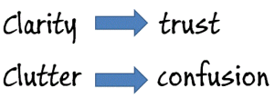
    clarity leads to trust; clutter leads to confusion

  3. Thus I moved onto the third site in Google AdWords…
    •  it was professionally laid out, gave clear direction to relevant parts of the site and written with a consumer in mind
    • they provide a 30 day free trial which built my confidence in them
    • includes a clear list of ‘for $x you get these features’ so I could assess if it suited my needs and budget straight away (and no need to waste their time on a non-qualified customer)
    • all packages even include a webinar on how to use the software, available to all my client’s staff – this is a great bonus and probably cost very little to produce
    • I trusted this business but the features my client needs weren’t there unfortunately – at least I knew that quickly, though
  4. Next, I looked at the fourth site from Google AdWords and saw 
    • lots of white space on the page and an overall professional look and feel
    • clear answers to key questions, followed by a list of benefits (eg saves time and improves revenue) and some testimonials – all on the home page
    • home page has a button ‘instant demo’ so I can see what is on offer and mentions a 30 day free trial – instantly developing my trust. And 30 days money back guarantee effectively means you get 60 days trial!
    • the home page has a feed from their blog – with 3 items from the last two weeks showing me it is current and they maintain their site
    • the pricing page is a comparison table of their plans, clearly showing the actual price and included features
    • their main menu includes ‘help’ which leads to a knowledge base and a lot more details than I need to know at this stage. Note the excess information was not in my face to overwhelm me, but it easily found which again builds my trust
    • I recommended this supplier to my client and we have since trialled the software and it is working very well in tests.

I actually looked at a couple more potential suppliers, but these four  showed the absolute importance of a good website to help you sell to prospective customers.

*Images courtesy of 123rf

Are simple messages simplistic?

IQ of 134 means smart (simple) but maybe good at school (simplistic)

Simple and simplistic are not the same…

While being closely related with the same root word, today’s pair of words are quite different – and understanding them can be quite enlightening. 

simple [adjective]: basic; missing elaboration, ostentation, complication and subdivisions
Basic arithmetic is simple to write and calculate; quadratic equations are not so simple!
Following main roads is simpler than maneuvering through side streets.

In grammatical terms, simple means having only one clause without any subordinate clauses or modifiers.

simplistic [adjective]: over simplified, missing information or depth
Saying income is the indicator of career success is simplistic.

Selling with Valentines Day

dollar sign inside a love heart

Love & money can go together

I know – Christmas has just gone, Australia Day hasn’t even arrived yet and I’m suggesting you think about Valentines Day!

For many businesses, Valentines Day is a huge sales period and they probably plan and prepare for it months in advance.

But have you thought about it for your business?

Maybe you think it is only for those selling flowers, chocolates and cards, having no relevance to other businesses. While there is some truth to that, you can get more out of Valentines Day if you want to.

Adding a Valentine flavour to your business 

Yes, Valentines Day is commercial and it would be great if we showed our love and care for others every day, but it is celebrated every February whether you like it or not. And if you run a business, you can keep it topical through using some Valentines romance.

There are a number of suggestions in my Valentines Day and business article, but here are a few more:

red paper flower made by a child

Paper flowers last longer and, if hand made, are very personal

  • post a Valentine message in your blog. It can be a simple “Happy Valentines Day” or maybe you can find a creative message to show you appreciate your blog readers or customers
  • use pink envelopes or paper on the day or the surrounding week or month
  • pop a chocolate or treat in every package you send out in February – of course, if it’s hot try something less likely to melt! Maybe a paper flower in each order is a better idea!
  • give an eBook or tip sheet with romantic ideas relating to your business
  • put some pink candles in your shop or display
  • run a competition with some romantic prizes
  • add a poem about mum or dad when you send out things for young children
  • send a rose to your key clients – an unexpected gift builds a lot of goodwill
  • Groups and clubs can send paid or active members a Valentines card. It needn’t include messages of love, but it may just be the only card your client gets so it will be appreciated
  • Web masters – think of adding some subtle graphics on your site – just a quick image and the words Happy Valentines Day is enough to convey your wishes without going too far or reducing your professional image
  •  Offer reduced fees for couples booking in at the same time in February. This could apply to a masseur, accountant, hairdresser, dentist, mechanic, coach, gyms, fitness trainers, life insurance sales people and many more.

Simplify your content

sucrose is sugar, words, formula and structure

Four ways to write the same thing – look for simplicity

I often come across things that are too complicated – usually it’s because people are trying hard to give all information, but that doesn’t change the impact on your audience.

If it is too hard to understand the message people get bored or impatient and go elsewhere; at best, they will contact you with unnecessary questions because that’s easier than searching the website or document for answers.

Examples of complicated communications

‘there are limits to how much super you can contribute each year’ (my version)

is easier to read than ‘legislation states people making superannuation contributions above certain prescribed maximums that vary between the types of contributions will be penalised’ (a complex version I read).

‘In Australia, you can see an optometrist without a referral. However, you will need a referral to see an ophthalmologist.‘ (my version)

is simpler than ‘No referral is necessary in Australia to see an optometrist or if needed with an ophthalmologist (you’ll need a referral from an optometrist or from your doctor for this)’. (from a complex article written for lay people)

‘ABC provides telephone support to customers at our discretion’ (my version)

is simpler than ‘ABC will provide Telephone Support at its sole option and for as long and for such hours as it may decide Telephone Support for the Customer.’ (from a contact us page, and let’s ignore that it doesn’t even make sense and doesn’t need all those capital letters!)

How to simplify your writing and web content

  1. write the absolute minimum message first, then add a few words as required
    For example, start with ‘we fix cars’ then add just enough to add value so maybe it becomes ‘we fix vintage cars’ or ‘we fix car engines’ or ‘we specialise in fixing red cars’.
  2. if you need to add more information, do it with additional sentences or in as few words as possible – don’t turn it into a very long sentence.
    So ‘We prepare tax returns for individuals. Our services include sorting your  receipts and documents and lodging your return.’ is better than ‘We prepare tax returns, including sorting your receipts and documents and lodging returns, for individuals.’
  3. know the purpose of your writing – is this a fact sheet that needs minute details or a marketing message that only needs an overview? Choose the level of detail to match your purpose and audience.


* Chemical structure courtesy of BigStockPhotos

Writing and grammar: Valentines Day is almost here

It is February and we’re almost at Valentines Day. I love (love heart) writing

Personally, I don’t care about the commercialism of the day. I consider it a reminder to acknowledge those people we care about, both romantically and otherwise, in a way we probably don’t think of throughout the year.

I aim to send a note, letter or email to people close to me for Valentines Day, just so they know I care all year, even when I forget to tell them.

For those romantically inclined, I wrote an article on writing love letters, and another on how to present love letters in a special way. I also wrote a number of Valentines articles for Save Time Online, including Valentines ideas for singles!

Writing Valentines Day

And for those interested, Valentines Day, Valentine’s Day and Valentines’ Day are all grammatically correct! It depends which grammar rule you believe is more important as to how you write the word!

Valentines Day – the name of an event, such as Good Friday or Christmas Day

Valentine’s Day – the day owned by or relating to Valentine

Valentines’ Day – the day owned and celebrated by valentines (lovers) everywhere

The same answer applies to Mothers and Fathers Day, too.

So what is your preference for writing Valentines Day? Is that just what feels right or have you thought about what is ‘correct’?


A funky gift is
nice without sending inappropriate romantic messages!

You can write great client letters

I wrote about an officious bank letter that resulted in me closing my account.

two sample letters to show short vs long text

Professional looking letters are part of your brand

There was more to that letter for teaching about good letter construction, so here are some tips for you…

  1. the letter was on two pages
    This was unnecessary, unavoidable and can really annoy readers. It looks longer so is off-putting and is just a waste of effort. With better writing it could easily have been shorter and their letter format included a lot of wasted space.
  2. one line of the letter contained only ‘if:’
    It is best practice to avoid a single word on a line (designers call this as leaving orphans and widows), especially such a short word
  3. every number in the letter was written as ‘three (3) years’
    Frankly, people can either read or they can’t, so ‘three’ or ‘3’ is sufficient – adding both is unnecessary and looks wrong
  4. first sentence is 3.5 lines long…
    It was simply too long, both visually and for comprehension. When in doubt, go for shorter.
  5. lack of clarity throughout the letter
    The letter went from the consequences to the definition to the impact for me so it was hard to follow – I had no reason to care about the consequences until I knew the relevance and definition!
    Remember to explain the relevance of any information first. They could also have improved it a lot by using a sub-heading for the full definition of inactive account – I could skim that section or read it for details without feeling confused.
  6. a missed personalisation opportunity
    The letter stated ‘your account referred to above’ – it’s not hard to mail merge (and they were already merging in my name and address!) so why not use ‘your xyz account’ which is more personal and easier to read
  7. an entire section was irrelevant to me
    why include a long paragraph, including two bullet points, on offset deposit accounts when I don’t have one? Setting up a conditional rule on this paragraph would be easy to do so it only goes to relevant clients. Or at least have it under a sub-heading so it doesn’t clutter the main letter and distract from the meaning


A drop of honey in your writing works

Some years ago, I opened a saving account with a higher interest rate for the proverbial rainy day. I haven’t used that account much for some time but received a letter from that bank  that I wanted to share.

Threatening feel

Angry man threatening a piggy bank with a hammer

Threatening people’s savings doesn’t create a good impression

With opening words ‘Inactive account’, the letter launched with a long paragraph about money in inactive accounts being transferred to ASIC. The paragraph ended with a ‘by the way, the Government recently changed the inactivity period to 3 years from 7 years’ message.

It went on to define in active accounts.

Followed by a sub-heading “Your inactive xyz account”.

At this point I was angry because I hadn’t been told about the change in law nor that my money would be transferred to ASIC so “how dare they do that”.

The letter then mentioned I could prevent the transfer by using my account before the end of January.

Why not tell me that first as it is actually the most important thing for me to know?

And encouraging me to make another deposit is surely in the bank’s best interests, too?

Why let me get angry and annoyed rather than show me they are trying to help my keep my money?

The harsh letter made me uncomfortable, and as I only had a small amount of money left in there, my response was to withdraw all my money and close the account myself.

This is obviously a necessary letter for banks, but I think they are missing a relationship building and marketing opportunity to write it in such harsh terms.

Even if most people still closed their accounts, they would do so without negative feelings towards that bank…

It could have been personable and helpful

happy businessman offering a hand shake

Being friendly builds goodwill and reduces stress

In contrast I recently wrote a letter for a client along similar lines.

That letter effectively read:

You haven’t made a contribution for some time so your account is about to be classed as inactive.

If you make a contribution by xx, your account will be reactivated. Otherwise, your account will have to be closed.

Another option would have been  to write:

Did you know that any account without transactions for 3 years are classed as inactive? And that we have to transfer money in inactive accounts to ASIC?

To avoid this for your account, please make a deposit or withdrawal by xx.

Or they could have focussed on the change in law as important news:

Did you know it’s been nearly three years since you used your account?

The Commonwealth Government recently changes the law so accounts are classed as inactive after 3 years rather than seven. That means your account could soon be classed as inactive.

By law, we must transfer money from inactive accounts to ASIC.

Of course, you can reactivate your account by making a deposit or withdrawal before xxx.

Which version would you prefer to receive?

 * Images courtesy of kozzi

28% young drivers killed

In 2007, 28% of Victorian drivers aged 18 – 25 were killed.

two crashed cars and an ambulance in front of a galss of whisky

Alcohol is a factor in the road toll, especially for young drivers

What a terrible statistic.

It’s also pretty surprising – at 30 June 2006, 902,796 Victorians were aged 18 – 24. 28% of that is 252,782.

The Victorian road toll in 2007 was 333.

So I looked at a Victorian Government website and found this sentence:

While 18 to 25 year olds represent around 14% of licenced drivers, they accounted for approximately 28% of all drivers killed on Victoria’s roads.

28% of the state road toll was 93. Awful to lose that many young people, but significantly better than losing 252,782 of them.

Checking meaning is important

That first sentence is perfectly acceptable in terms of grammar and spelling, and it makes sense when you read it.

But the authors and editors of that text book (yes, I found that sentence in my daughter’s current VCE text book on health) didn’t check that the correct meaning was being communicated.

There is a huge difference in meaning between 28% of young drivers were killed and 28% of killed drivers were young.

Somewhat detracts from the credibility of that text book, doesn’t it?

Do you think I should read the entire book and check every fact they state, or assume it was a one-off?


* Image courtesy of kozzi

Reviewing the usefulness of old content links

Old content can still be good or it can be out dated, depending on the topic and the opinions given.

Since May 2012, I have ended each month with a blog post referring back to some of my old content (from my newsletter and blog). I’ll list all seven posts at the end of this one.

It has been interesting to read things I wrote in the past and think about how relevant they are today and how else they can be applied to good business communications.

To be honest, much of my content does still apply as writing doesn’t change rapidly – had I written about mobile phones or social media it probably would have been a different story!

Did it work?

Looking back, reviewing old content each month:

  1. was an easy way to find new content I guess – there was some time involved in deliberately going back to that month of past years and I did have to think of what to write about the old content
  2. created easy posts to write in advance and schedule
  3. helped build more links within my site, especially bringing some of those older pages back to life.
  4. didn’t have any significant effect on the number of readers to those posts (compared to posts made around the same time, there was little variation in reader numbers – with the exception of making procedure manuals accessible which was 3 to 6 times more popular than posts within a week of it going live). Given only one post stood out, I’d say it was more about the topic than the old content link.
  5. also didn’t seem to have attracted particularly more or less discussion either
  6. took advantage of work I did in the past – leveraging is a great concept!

The biggest question to me, however, is what you thought of it.

Was it interesting to revisit old content? Or maybe I was too subtle and you hardly noticed that I was doing it?

Would you like me to continue this into 2013? If so, are there any changes you would like me to make?

My old content driven posts were:

May – planning future communications
June – making procedure manuals accessible
July – knowing the right terms
August – consistency over stats
September – reading efficiently saves money
October – accepting feedback graciously
November – dividing up business tasks
December – honesty in blog comments

Honesty in your blog comments

Once you start blogging you will start getting comments. Unfortunately, a large proportion of them will probably be spam, but the real comments are great.

What about the real but not-so-great comments you may get?

As I wrote a few years ago (back in December 2007 to be precise – old content that still rings true!), I think you have five choices about how to act on negative comments.

Spam and outright abuse I think should be deleted and forgotten.

Comments that just disagree with you or  realistic or even constructive  criticisms are a different story.

Keeping negative comments in your blog seems honest to me – you’re not censoring and are being transparent.

It may be confronting to leave negative comments live, but it gives you a chance to be human and show that you are open to feedback – especially if you show that you have learnt from it.

Have you ever left negative comments in your blog? What response have you got from doing so?

Would you use negative comments to stir a controversy or a discussion?