I hope you find my writing and business tips and observations useful. My business and blog are dedicated to helping businesses communicate clearly and reach their potential.
Read, subscribe to my newsletter, enjoy!Tash
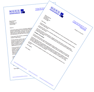
You can write great client letters
I wrote about an officious bank letter that resulted in me closing my account.
There was more to that letter for teaching about good letter construction, so here are some tips for you…
- the letter was on two pages
This was unnecessary, unavoidable and can really annoy readers. It looks longer so is off-putting and is just a waste of effort. With better writing it could easily have been shorter and their letter format included a lot of wasted space. - one line of the letter contained only ‘if:’
It is best practice to avoid a single word on a line (designers call this as leaving orphans and widows), especially such a short word - every number in the letter was written as ‘three (3) years’
Frankly, people can either read or they can’t, so ‘three’ or ‘3’ is sufficient – adding both is unnecessary and looks wrong - first sentence is 3.5 lines long…
It was simply too long, both visually and for comprehension. When in doubt, go for shorter. - lack of clarity throughout the letter
The letter went from the consequences to the definition to the impact for me so it was hard to follow – I had no reason to care about the consequences until I knew the relevance and definition!
Remember to explain the relevance of any information first. They could also have improved it a lot by using a sub-heading for the full definition of inactive account – I could skim that section or read it for details without feeling confused. - a missed personalisation opportunity
The letter stated ‘your account referred to above’ – it’s not hard to mail merge (and they were already merging in my name and address!) so why not use ‘your xyz account’ which is more personal and easier to read - an entire section was irrelevant to me
why include a long paragraph, including two bullet points, on offset deposit accounts when I don’t have one? Setting up a conditional rule on this paragraph would be easy to do so it only goes to relevant clients. Or at least have it under a sub-heading so it doesn’t clutter the main letter and distract from the meaning


Leave a Reply