I hope you find my writing and business tips and observations useful. My business and blog are dedicated to helping businesses communicate clearly and reach their potential.
Read, subscribe to my newsletter, enjoy!Tash
Simplify online forms for everyone’s sake
Filling in the account details on a website form today I was reminded of how difficult things can be when someone assumes knowledge.
Yes, we all KNOW that if you assume you make an ass out of u and me. But that doesn’t stop many of us making assumptions that we shouldn’t.
And I suspect that online forms is one area where people just get a form put together quickly without really thinking about making the form easy to use and highly effective.
Contact forms need to be simple to use
Today, I was faced with two boxes under the title ‘Your name’.
So I had to figure out if they wanted Tash then Hughes or Hughes then Tash, or maybe Tash Hughes and the second box shouldn’t have been there at all.
It was obvious to the person creating the form what they wanted, but not so obvious to me, the paying client.
With just a little more effort on their part, the form could have been better labelled or set out and thus been much simpler to use.
Complex and unclear forms lose sales
I reread a blog post recently that gave a perfect example of how a simple form impressed a potential client – and a vague form (that was also hard to find) turned that client away from the business.
A poor form can be that serious – people may not be patient enough to work through the issues so you could lose a customer. And possibly earn some bad comments elsewhere.
Making your forms simple
There are many ways to simplify a form, whether it is an order form, contact form or an online survey/feedback form. And what works with one form may not work well with a different form, so there is no simple answer for making your forms effective.
However, here are some generic tips to help you keep your forms simple:
- think about what information you really need to meet the purpose of the form THEN write the questions to gather that information. And decide which of those answers is a must-have, and which can be optional
- think about who is going to use your form then choose wording and question styles to suit them as much as possible
- use one label per box*
- provide options to choose, rather than text boxes, where possible. So a street or suburb field needs to be empty but you can give a choice of states
- in a select an answer question, don’t give more options than necessary – if your provided answers don’t cover all possibilities, add ‘other’ or ‘custom’ as your final option
- reduce clutter around the page
- use clear wording to explain what you expect in each field
- use consistent wording. For example, if the first field is ‘your name’ make sure the next field is ‘your address’ not ‘my address’
- make the final button obvious – both in placement and size but also in the text you use. It is more effective to have a button that says ‘place order’, ‘send message’ or ‘request quote’ than plain old ‘submit’ – just like the ‘tweet’ button on Twitter and ‘publish’ button in WordPress.
Got any questions about making your forms simpler and effective? Why not ask below as a comment, or send me an email?
* If you are using a form with one box per letter (usually only for printed forms), this tip becomes use one label per obvious group of boxes.
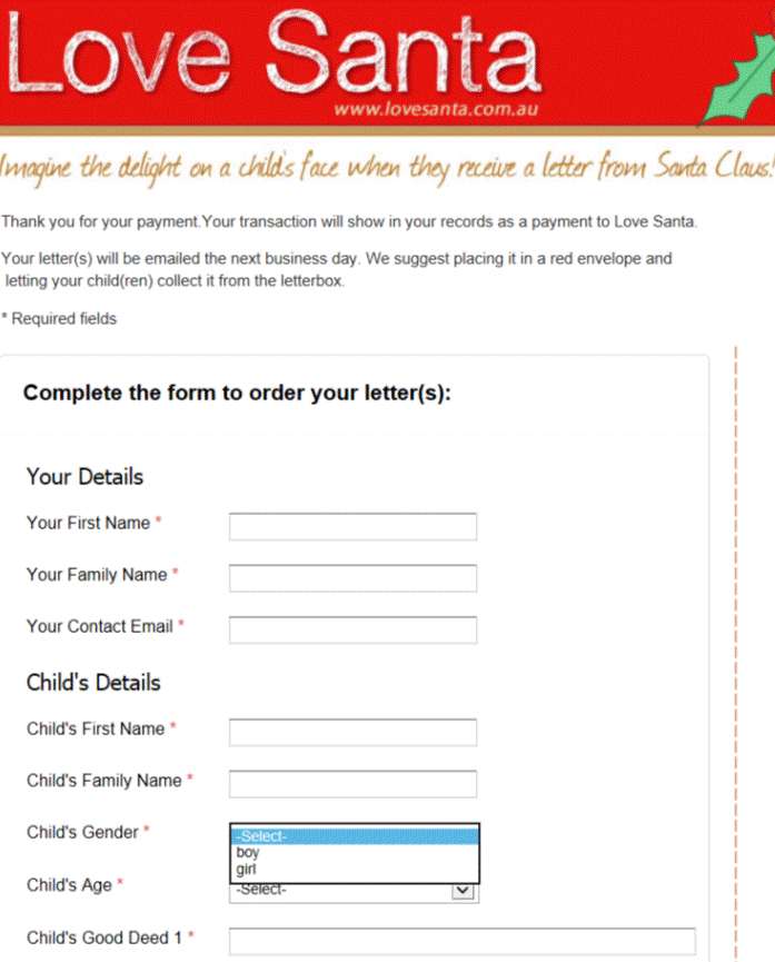
Image of form courtesy of Love Santa


Leave a Reply