I hope you find my writing and business tips and observations useful. My business and blog are dedicated to helping businesses communicate clearly and reach their potential.
Read, subscribe to my newsletter, enjoy!Tash
Make your website more accessible
Following on from the Canadian court case and why accessible websites are a good objective, it’s time to share idea on how to make site accessible.
Principles of accessible websites
According to WebAIM (Web accessibility in mind), the key aspects of an accessible site are:
- appropriate alternative text (ie alt tags for images and graphics)
- headings for data tables (ie appropriate table headers in the code, using <th>, not just titles in columns and rows)
- ensure forms have labels for every field (ie use
- use meaningful text for links so they can be used out of context (ie don’t use ‘click here’ and ‘read more’)
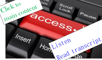
- add captions and transcripts for audio materials (including videos)
- make attachments (eg a pdf, doc or Powerpoint document) accessible too or convert them into an html format
- enable people to skip repeated content (such as navigation menus that are on every page)
- don’t rely on colour or font changes to convey meaning
- make content clear and easy to read
- be careful with the use of JavaScript – make it usable without a mouse and make pages work without JavaScript
- design to w3c standards – CSS sheets help readers separate out presentation details from the content; html pages are easier and actually more SEO effective
Following these principles
Making your website accessible makes sense.
The principles are fairly simple and non-expensive to follow. I know I adhere strongly to some of them – and others I just didn’t know or think about. And some aren’t so relevant (for instance, I don’t use JavaScript on my site).
Which of these principles do you follow all the time? Which did you not realise were possible or an issue?
I know it will take me a bit of time, but I am going to work my way through that list (well, the ones I haven’t done in the past) so I can learn how they work and implement them. Starting with form labels and table headers as I didn’t know these existed before now.
As I learn more, I will share that knowledge – the more awareness we share, the more we can make the internet accessible and inclusive. Will you help make it so?
Why should your website be more accessible?
Why wouldn’t we want to make our website accessible to all sorts of people, including people with limited abilities (such as visually or hearing impaired people)?
I read yesterday that a court case in the USA is showing that many sites are not easily accessible to the disabled (visually impaired people on this specific case) and may actually be breaking the law by excluding accessibility considerations. Legal aspects of accessibility I know nothing about, but morally and from a business perspective, I know an accessible site is a good aim.
Why make your site accessible?
Well, why not really?
The obvious answer is that the more accessible your site is, the more people can visit it and so you increase your sales or influence by having a bigger audience. Making it accessible also builds trust and credibility for you and your brand.
Also obvious is that you are welcoming all people and being a decent human being to not make life harder for certain groups.
Would you build a cafe and not have a ramp for wheelchairs/prams or refuse to describe your menu to someone who couldn’t read it? Of course not, so why not do the same with a website?
Computers can do many things these days, so don’t assume a blind person can’t read websites so doesn’t go online. There are tools that read webpages to the blind. There are anti-spam tools that rely on audio for those who can’t read the captcha images. Text on websites can be expanded to be seen by those with limited vision.
And so on.
For someone who finds it difficult to hold a book or turn pages of a magazine, how much easier is it to move a mouse and read on a screen? Or use a verbal command to flick between webpages?
Just like a computer reading a webpage is easier than getting someone to read to you if you have limited vision.
Or a website offering written transcripts of speeches and presentations enabling the deaf to know what’s going on.
Or being able to search for a website that offers an understandable version of something for anyone with intellectual disabilities.
We can make life easier for people
The internet has opened so many doors for us as a society.
As website owners/managers, we can open those doors further by making our websites accessible to the disabled.
I have long added alt tags to images, for example, so a visually impaired person can be told what the image is about.
There are other things that are easily done that I wasn’t aware of. Now I am aware, I will start implementing them.
My next post will list some of the ways we can make our sites more accessible.
But what do you do on your website(s) to make it W3C compatible and accessible? Why do you make it accessible, even to a small extent?


Recent Comments