I hope you find my writing and business tips and observations useful. My business and blog are dedicated to helping businesses communicate clearly and reach their potential.
Read, subscribe to my newsletter, enjoy!Tash
Always include critical details when writing promotions
What is the point of promoting something without explaining how to get it?
Due to my connection with Love Santa, I keep an eye on Christmas news around the world. Recently, I went to a site to read about some Christmas movies coming up – it mentioned things like Home Alone and How the Grinch Stole Christmas (one of which is debated to its place as a Christmas movie every year!) This is a news type site with a section on entertainment – it was Australian but I hadn’t been there before.
What struck me though was the lack of basic and critical details. Paraphrasing, the article said “SuperChannel {made up name!} is starting some Christmas movies in November and here’s their full schedule”‘ then listed all the movies for November.
The article had some links to other pages on the site about types of movies and so on, but no link to SuperChannel.
Personally, I have never heard of SuperChannel so I’m pretty confident it’s not a free to air TV channel. So how do I see movies they play? It is within a subscription to an on-demand service? Or maybe its an online channel of some sort?
Write it, don’t assume!
When writing, for pleasure as well as business really, make sure you give necessary information rather than assume people know it. Even when you know the audience well, be careful to not miss important details.
From the article I mentioned above, I can now tell you when Home Alone will be showing. I have no idea how to find it and watch it, so knowing the timetable is fairly useless. Maybe the writer or site assumes ‘our site members knows SuperChannel’ but what about new members or people coming across the article (as I did) for the first time? What about the members who know the name but can’t recall access details?
Even if your audience does know the basics, where/how to access something you are promoting is critical information to include.
Grammar makes for a busy pharmacist!
Last night I saw a TV ad for some (legal) drugs for children’s colds.
It was nothing particularly out of the ordinary until I read the fine print at the end, which was grammatically poor.
For children under two years, contact the pharmacist.
Obviously there is only one pharmacist we could ask – must be a mighty busy person though if we only have one in Australia!
The grammar…
In short, using the word ‘the’ implies there is one so we correctly write ‘the Prime Minister is visiting the Governor General’.
When used as an article for a noun, the word ‘the’ signifies that the relevant noun is either unique or somewhat special. For example, the Tour de France is the long distance bike race – obviously, there are other long distance bike races but the Tour De France is the ultimate and best known one so using ‘the’ emphasises its importance.
So the ad would have been better telling us to contact ‘your pharmacist’ or ‘a pharmacist’.
* Image courtesy of 123rf
Correct details in tests are critical
I came across another example of errors in details being an issue.
Our daughter’s school sent out an email including ‘(1 of 2)’ in the subject. The attached pdf explained they were testing the communications system for parents so we should expect two emails – if only one arrives, contact the school.
Testing communications seems like a good plan and the test seemed simple enough.
Then I got a second email which referred to being the first email of two and had the same attachment. Was it an error to get this email twice or did they accidentally send it twice? Should I reply to say I got it twice, possibly like hundreds of other parents, or give them a chance to explain the duplication first?

Responding to a mistake can lead to a flurry of emails – avoiding that is one good reason to check details before hitting send!
Then, I got a third email asking me to log into the school’s site to read a letter. The letter was the same attachment as in the original email (which clearly states ‘this is the first email and please contact us if you don’t get a second one’).
Which detail is wrong – the letter stating a second letter was coming or the sending of the same letter twice?
Where does that put their test?
On one hand, I got both types of email so the systems are working and my contact details are correct.
Do they have my email address in the system twice so I will get two versions of every group email they send?
Was it human error to get the same attachment in the second email type or is that a failure of the system?
I can not reply as I got both emails or I can reply and explain I got three emails and the same attachment.
Which do you think will help their testing process more? What would you do?
Get the details right
Are you a details person?
Many people are bored by details (probably all of us really – we just like details in some things, not all things) and that includes details of grammar and good writing.
You can’t convince me with poor attention to details
I received a letter a few days ago.
I like getting letters, and it doesn’t happen as often now we have so many electronic options available to us. So it’s disappointing when the letter turns out to be spam or a scam rather than something interesting.
This particular letter I recognised as spam straight away as I’ve received rubbish from this group before (and so have clients who luckily ask me if it is legitimate before acting).
However, standing in the sun was nice so I actually read their letter and found numerous reasons to not act as they wished.
- they were using an email address I have never used so obviously made it up – to convince me you are credible, use my real email address
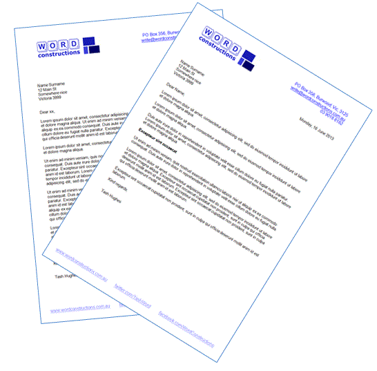
- they missed the .au in my email and website addresses – and coming from an Australian company wanting to promote me in an Australian directory makes it even more pathetic to my mind. It wouldn’t take long to look at my website to discover the .au in the URL
- it was sent to my home address but addressed to Word Constructions – a detail that made me instantly suspicious anyway.
- paragraph one includes “This now includes additional subscriber benefits listed below” which is grammatically poor; paragraph three includes “… entitle you to additional subscriber benefits (see below).”
However, the letter does not contain any subscriber benefits. - a smaller detail is lack of consistency such as “The Internet reaches 15 million… (internet analysis…” (Internet or internet – they need to choose one and list that in a style guide)
- multiple sentences were missing words or just didn’t make sense – one will be discussed and improved in my March newsletter I think!
- two sentences in a row ‘kindly’ requested me to do something – is it kind of me to sign a form to (supposedly) get promotion via their directory?
Businesses need to watch the details
Get the details right and people are not distracted by the mistakes – meaning they can focus on your call to action or message.
[Tweet “Get the details right and people are not distracted by mistakes”]
Get the details wrong and people doubt your professionalism and worry whether you pay attention to details when they are paying you. That is, if you throw together a letter instead of putting effort into every word of it, will you also rush through fixing my car, cutting my hair, building my house, designing my website and so on?
It’s nice to think people will ignore errors because we’re nice people with good intentions.
But first impressions count and if those incorrect details are the first thing a potential customer sees, it can be enough to give your competitor the job.
So how does your business avoid errors in the details?
How does your business react to potential suppliers if they get details wrong?
Translation and transcription styles
As a writer and communications manager, style guides are important.
It was only when I read a book by a freelance translator and transcriber, Kris Emery, that I thought about style guides for other professionals dealing with words.
Getting written documents
If your business need documents translated or meetings transcribed, you are paying someone to give you a written document that will be used in some way.
So obviously you want that document to be prepared in a way that is easy for you to use.
That could include details such as :
- being in your prefered font size so it’s easy for you to read and manage
- spelling certain words in a particular way – it could be ebook vs eBook or it could be how you want your business or product name represented (think of AvSuper, McDonalds and WordPress for instance)
- putting meeting records into columns to separate names from conversations
- location of your logo – you could add it yourself, but why not get the document ready for use?
- having page numbers or preparation dates in a certain place on each page
- things to exclude from a transcription (eg remove um, ah and y’know but leave uhuh)
- page margins or text justification that suits your needs, such as fitting onto a letterhead or space for notes around the text
Preparing a style guide
You have a number of options really…
- rely on the person just to translate/transcribe and change the style yourself
- assume the person will give you a nice format without guidance and just fix the rest – or get lucky and find someone who will ask the questions to give what you want (and probably write a style guide themselves to use when they next work with you – expect to pay for it if you want access to that style guide yourself)
- provide a template and hope the person doesn’t adjust it or any coding behind it
- provide a style guide (or at least a style sheet if your requirements are few) for them to work from
A document-specific style guide will by nature be about details, lots of little details that add up to a polished and useful end result.
It can be pulled together in two hours or so if you have an existing document to work from; faster if you have a style template to work from. That’s not much time compared to adjusting a document every time someone translates or transcribes for you.
What are the first three things you would add to your style guide?
Are they things you consider the most important or just the hardest to do so you prefer someone else gets them right?
You’d think the big guys would get it right…
Is it just me, or do you have more tolerance of a small business making mistakes than a big business?
That is, for mistakes like spelling errors, dead links on their website, out of date information and lack of clarity in a message.
I think if you have the budget for huge campaigns, you have the budget to get a writer or editor to help you avoid stupid mistakes. A sole trader on the other hand often has less money to spend and more hats to wear so mistakes are a little more excusable.
Budget for the details
I was asked by a major entity to complete a survey that they intend to use to produce some data that can impact on the digital media and brands.
It was longer than I expected but more than that, it was very disappointing from a group that is producing such a report.
Having a poor survey through lack of attention to detail reduces their credibility – if they can’t get the questions right, is their analysis going to be any good?
Compared to the time and money they have put into preparing and promoting this survey, and then turning the results into a report, it would have cost little to have had it reviewed by a writer or editor to ensure it would work. It’s like spending a million dollars to build your dream house but not checking the architect remembered to add a front door.
International survey
Some of the issues I came across in this particular survey were:
- I was invited twice (ie via two different .com.au email addresses) to complete this survey. Yet there was a question ‘Please enter your five digit zip code’ – my four digit postcode wasn’t accepted. So are they so ignorant to not realise we don’t all have a US zip code (the error messages actually stated “You must enter a valid US zip code”) or was this survey only meant for US residents?
Tip: if preparing any sort of online form, make it usable for all aspects of your audience – and make it clear at the start if some groups can’t participate - There were too many assumptions within the questions, but I had to answer them anyway so they are getting meaningless results from the survey. For example, “which of the following do you generate money from?” listed about six possible answers – I don’t earn money from any of them but there wasn’t a ‘none of the above’ type answer.
I did get some satisfaction in a couple of those questions if they at least gave an ‘other’ option as I wrote the real answer in that field!
Tip: always have an answer for everyone in a survey – if people can’t answer, they can skew your results with dummy answers and it frustrates them - One question asked ‘what is your key source for finding companies that don’t meet your requirements?’ followed by a series of criteria that you could use to filter out a company and a couple of other points. In other words, it made absolutely no sense and I couldn’t answer it – well I used the ‘other’ field to say it made no sense so I couldn’t choose from their list!
Tip: always do a final read of materials to ensure everything makes sense. Edits along the way can change things so read it in full to be sure – and preferably get fresh eyes to view it, too.

Poor data can’t result in a good report, whichever way you add it
One better written question they included asked where I got inspiration for my blog posts. I could only select one answer, which is limiting as I find inspiration in many places. However, I again used the ‘other’ option and wrote I am inspired by poor communications efforts I see – such as surveys like this with poor questions! You have to find fun where you can, I say!
So not a great survey (and I will struggle to trust their results) but it did inspire a blog post and gave me some amusement using their ‘other’ fields!
Checklist for finalising an annual report
Producing an annual report is a huge job – there are so many details to co-ordinate. Before signing off a final draft, I always get the following items checked at least once, often using different people for specific list items so they can focus and are more likely to spot any errors.
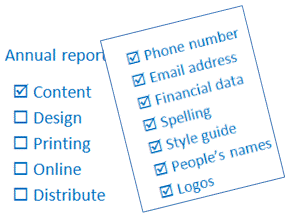
Annual report checklist
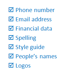
- company data
- ABN and similar numbers
- phone number
- address
- online addresses
- logo is present and used according to the style guide
- contents page numbers
- spelling (especially company, people and product names)
- technical details (eg is it $36 per 100g or 100kg?)
- figures and data (eg financial tables, returns data)
- people in photos are named correctly
- labels on images are correct and with the appropriate image
- mandatory details are included (various industries have specific items that must be included)
- images and graphics are appropriate for the brand and ok to use (copyright, model permissions, etc)
THEN
- report flows from cover to cover (ie read every word in order)
- check everything fits correctly (eg remove orphans and align page breaks)
If all the above have been checked thoroughly, your annual report is correct and can be signed off ready for publication.
It’s easy to rush through this section because time is running out nad everyone’s a bit over the whole project by the end. However, it is such an important part of the process and needs to be carried out diligently (such as having multiple people involved).
When planning the annual report process, I always allow a week and preferably two weeks for the review. Not only does this reduce the rush, it gives me spare time if changes are required and a second review becomes necessary.
Do you have a checklist for finalising an annual report or similar large project? Do you involve multiple people in the review process?
Include everything you should…
I just read a newsletter that arrived a couple of days ago and spotted a huge error. They provided a recipe, introduced it, gave the heading of ingredients and then listed the nutritional value and method. Literally.
In other words, not one ingredient was listed – some were explained in the recipe itself but most didn’t have quantities listed and ‘dry ingredients’ could include a few things!
So learn from their mistake and check you always include all the important details – then check again as part of your proof reading!
Product Disclosure Statements – what are they?
Do you know what a product disclosure statement (PDS) is?
Many people now use them, and various companies refer to them in their advertising, but from personal conversations about things I write, I know many people don’t know what the term means.
A PDS is simply a document listing the key features of financial products are described; it is the little booklet you got about your savings account, insurance policy, super account and so on. Basic topics covered by a PDS include fees, options, inclusions and joining/buying the product.
There are variations between industrires and companies but generally the company has to make a PDS available before you buy their product – they can’t make you read it obviously but they must have allowed you that opporutnity.
A PDS is a point of reference when deciding between products and when you need to know something later (eg does my house insurance cover rising water or just floods?) Many PDSs are long and may not be visually appealing, but they are worth holding onto.
Giving people a choice of contact…
Through recent conversations, the topic of contact details has come up (again!) So let me start by asking – do you prefer to be contacted by phone or email, or something else? When leaving your details for a business to contact you, do you like giving lots of details or just choosing the ones that suit?
I have explained before that I prefer getting emails than phone calls as a general rule, so maybe I am a little biased!
However, I don’t like filling in forms on websites that ask for a lot of information because it wastes my time and gives them more than I think they need to know. For example, if I am asking you to email me something, why do you need my phone number and postcode?
My favourite collection forms are those that let you fill in phone or email or whatever, or at least ask what your preferred method of contact is. And I’m pretty sure I’m not the only one who prefers a choice…
Along with choosing what contact details you give out, remember to consider what you ask for, too.


Recent Comments