I hope you find my writing and business tips and observations useful. My business and blog are dedicated to helping businesses communicate clearly and reach their potential.
Read, subscribe to my newsletter, enjoy!Tash
Who can read the sign?
We attended an indoor play centre recently for a child’s birthday party.
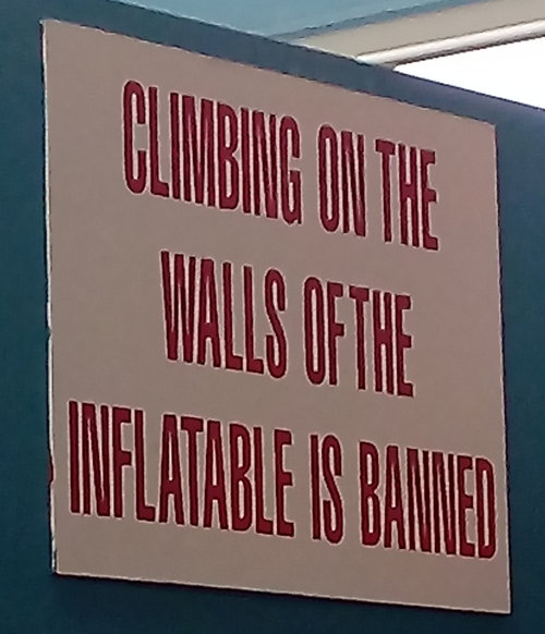
I spotted a sign on a wall opposite an inflatable slide, within the enclosed rock climbing area, that I think was missing the audience.
Where the sign was
The sign was up on a wall and printed in a large font so it should have been useful.
However, it was on an angle that made it hard to read except for by children rock climbing.
Surely putting it above the inflatable would have been more effective as it would be visible at the time you would be considering climbing up the forbidden walls.
What the sign said
Remembering this was in an indoor play centre where most of the patrons are under eight years of age, the sign was not written for the audience.
Apart from the very young children who can’t read at all, many youngsters would not be up to reading ‘inflatable’ and many would not know the word ‘banned’. Even for those who can understand the sign, it will be most effective if people get it instantly, without having to think about its meaning.
The inflatable is more known to children as the big slide, so that is the type of language they would be better using.
A much simpler sign would be “Do not climb up the slide”.
I think this is simpler and more effective, but also has a second meaning as it tells children not to climb up the slide itself, as well as not climbing on the support walls.
It is always important to know who you are aiming your communications at, and aim for clarity more than cleverness.


Leave a Reply