I hope you find my writing and business tips and observations useful. My business and blog are dedicated to helping businesses communicate clearly and reach their potential.
Read, subscribe to my newsletter, enjoy!Tash
Simple words, simple fonts
I often suggest using fewer words to make reading your message simple and easy.
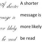
Roger Dooley, author of Brainfluence, has added a new form of simplicity to effective communications – simplicity in fonts.
Research has shown that ornate fonts make a task appear to be more time-consuming than the same task written in a clearer, simpler font. An ornate font could actually make your products and services seem slow or tedious, which is obviously not an image you want to promote.
Dooley stated that a simpler font will communicate your message better because it is easier to read and looks easier to read (i.e. is more appealing). Just like a simpler message is easier and more appealing.
What do you think – does a fancy font impact on how you perceive a product or service?
PS The recommendation is to use a clear font such as Arial for descriptions and instructions.


