I hope you find my writing and business tips and observations useful. My business and blog are dedicated to helping businesses communicate clearly and reach their potential.
Read, subscribe to my newsletter, enjoy!Tash
Simple words, simple fonts
I often suggest using fewer words to make reading your message simple and easy.
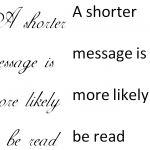
Roger Dooley, author of Brainfluence, has added a new form of simplicity to effective communications – simplicity in fonts.
Research has shown that ornate fonts make a task appear to be more time-consuming than the same task written in a clearer, simpler font. An ornate font could actually make your products and services seem slow or tedious, which is obviously not an image you want to promote.
Dooley stated that a simpler font will communicate your message better because it is easier to read and looks easier to read (i.e. is more appealing). Just like a simpler message is easier and more appealing.
What do you think – does a fancy font impact on how you perceive a product or service?
PS The recommendation is to use a clear font such as Arial for descriptions and instructions.
Font sizes…
Surfing some of my favourite blogs today, I came across a post by Donna-Marie about choosing suitable fonts. As well as being a good summary of which fonts work well in different media, it reminded me of someone recently asking about using different sized fonts – and recent experiences of unsuitable font choices.
I remember doing school assignments where I’d use different fancy fonts for each heading and changed the text to suit the amount of information in each section, and so on – and I was proud of being so versatile! But looking back (or at children’s work now) I can see that it looks childish and puts the focus on the fonts rather than the content. It isn’t very professional to give the impression you are trying to minimise the content!
As a general rule, it is better to stick to one font style and size in a single document. It is consistent which makes it easier to read (the eye doesn’t have to keep adjusting to different fonts) and it also looks clean and professional. And to be honest, it is also easier to prepare than swapping fonts all the time!
The common exceptions in font sizes would be:
- heading and sub-headings are often a little larger than the text font
- labels on diagrams and tables are often smaller to work with the labelled items
- the ‘fine print’ such as a disclaimer, a copyright notice or unsubscribe information – this text can be smaller but it must still be big enough to easily read so less than 8 point is getting too small in most cases. I recently edited a document which had footnotes to a table in a 7 font and it was too small to read and also looked out of place amongst the 11 font table and general text.
- fonts within an ad design may show more variation, but be careful to not overdo it
If you are tempted to change font sizes to break up a chunk of text, consider bullet points, italics, bold, more paragraph breaks and page layout as alternatives.


Recent Comments