I hope you find my writing and business tips and observations useful. My business and blog are dedicated to helping businesses communicate clearly and reach their potential.
Read, and enjoy!Tash

You can write great client letters
I wrote about an officious bank letter that resulted in me closing my account.
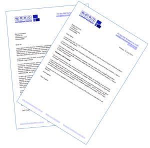
Professional looking letters are part of your brand
There was more to that letter for teaching about good letter construction, so here are some tips for you…
- the letter was on two pages
This was unnecessary, unavoidable and can really annoy readers. It looks longer so is off-putting and is just a waste of effort. With better writing it could easily have been shorter and their letter format included a lot of wasted space. - one line of the letter contained only ‘if:’
It is best practice to avoid a single word on a line (designers call this as leaving orphans and widows), especially such a short word - every number in the letter was written as ‘three (3) years’
Frankly, people can either read or they can’t, so ‘three’ or ‘3’ is sufficient – adding both is unnecessary and looks wrong - first sentence is 3.5 lines long…
It was simply too long, both visually and for comprehension. When in doubt, go for shorter. - lack of clarity throughout the letter
The letter went from the consequences to the definition to the impact for me so it was hard to follow – I had no reason to care about the consequences until I knew the relevance and definition!
Remember to explain the relevance of any information first. They could also have improved it a lot by using a sub-heading for the full definition of inactive account – I could skim that section or read it for details without feeling confused. - a missed personalisation opportunity
The letter stated ‘your account referred to above’ – it’s not hard to mail merge (and they were already merging in my name and address!) so why not use ‘your xyz account’ which is more personal and easier to read - an entire section was irrelevant to me
why include a long paragraph, including two bullet points, on offset deposit accounts when I don’t have one? Setting up a conditional rule on this paragraph would be easy to do so it only goes to relevant clients. Or at least have it under a sub-heading so it doesn’t clutter the main letter and distract from the meaning
Useful policies are short
If you take the time to prepare a policy or procedure,then you may as well make it accessible to people, right?
 I just read a blog post discussing how the average internet user could spend 76 business days a year reading privacy policies that affect them. 76 days!
That is based on the average policy having 2,514 words. Which is a lot of words for a policy that basically needs to say ‘we will only give your information to Fred under these circumstances’.
And it is an average. Some places have very short privacy policies (for example, if you subscribe to my newsletter you will see a 34 word policy!) so that must mean other places have extremely long policies.
So next time you write or update a policy, keep it as short as possible by
- using simple words as much as possible so it is easy to understand
- avoiding legalese so it makes sense to everyone and doesn’t look intimidating
- think about your reader – what do they want to know and expect to see?
- use an active voice as it is generally shorter than a passive version of the same sentence
- use bullet points and sub-headings to organise the policy – this is easier to read, often means less repetition is necessary and sentences don’t need to be so complex.
Legally, you may be covered by providing a policy even if people don’t bother reading it (how often do you read the policies you agree to online?) but I wouldn’t be comfortable with including unexpected details that could hurt people later. That is, the legal issue is not always the moral one so I prefer policies people are more likely to read.
As a business owner, do you just want to protect yourself or do you want people to properly understand your policies?
Writing enticing headings
The headings you use in blog posts, tweets, articles, ads, media releases and the like are a critical aspect of your ongoing success. This also includes sub-headings, titles of tables/images and other stand-out text.
 Busy people will only read on if the heading promises something they value right now.
People surfing the internet will only read more if your heading catches their attention, and holds it.
So it is worth putting some effort into making your headings enticing so you maximise the number of people reading whatever your heading leads to. Here are some tips on making your headings more effective:
- where feasible, use ‘you’ to personalise and catch attention. It also helps you to remember to make your message aimed at your audience
- apply ample alliteration 🙂 Repeating a letter is attention grabbing which gives your headings more impact.
- use questions – it is like building some suspense as people are interested in learning the answer
- be interesting or unusual, possibly even a little controversial, within the bounds of the message and brand you are portraying. This can be as simple as choosing a less common word such as Clydesdale instead of horse or scoop instead of update, or taking a different approach to a common subject (eg. ‘finding quirky blog content ideas’)
- include a number to introduce a list, such as 5 tips to support email marketing
- make an offer they can’t refuse like “the secret of getting twitter followers” or “meaningful posts people love to read“
- keep it short – two-part and too long headings are not as visually appealing and don’t belong in any form of marketing, especially not digital media where short works best (consider the 140 character limit on Twitter!)
Can you remember any effective headings? Do you know why it was effective?
Making your sentences effective
Put a few words together and you have a sentence; put some carefully chosen words together and you have an effective sentence. And effective sentences have much more power in communicating a message and helping your business.
If you look at two sentences saying the same thing, there often is not a right or wrong version. For example, ‘Tash is a professional writer based in Australia’ and ‘Based in Australia, Tash is a professional writer’ are both perfectly good sentences.
However, one form of a sentence may well be more effective in a particular context. Think about the purpose of the sentence – is it an instruction, a description, an inducement or an explanation? An explanation or instruction needs to be as clear as possible while an inducement may be effective with a hint of mystery.
When reading one of your sentences (or comparing multiple versions of a sentence), the following list may help you determine which is the most effective for your purpose.
- clarity – can the sentence be easily understood on the first read?
- meaning – does the sentence give the correct meaning? Mixing pronouns, making it too long, over using punctuation and inappropriate word use can all obscure the meaning
- flow – does the sentence move smoothly or are there bits that break concentration and flow? Of course, a deliberate break in flow can emphasise a point, but generally a smooth flow is your aim. Flow with the surrounding sentences is also important
- congruent – do all the words join into one unit that works logically? do all the words seem to belong there?
- concise – does every word deserve its place in the sentence? If in doubt, try the sentence without that word and see if it is more effective
- prominence – are key words and ideas shown as the most important? Generally, the words at the start and finish of a sentence carry the most weight so that’s where key words are placed for greatest effect
When testing your sentences against this list rememebr that reading them out loud can be a very useful tool – your tongue and ear will pick up issues your eyes may miss.
Work like ours…
How would you react to a website like this?
“we treat the floor and work like ours. We are trying to keep it in cheapest price. If you online quotation we give you 5% discount.”
As key phrases about their benefits on the homepage of a website, the above statements really need some work.
What’s worse is the page title for their homepage includes ‘ploors’ instead of floors.
We came across this site as potential customers, and to be honest we’re reluctant to even get a quote after seeing such errors (trust me, there are many , many more with the site!) They are local and we’d prefer to use a local small business so it just proved to me again how big an impact bad writing can have on your business.
In this case, I suspect English is not their first language and I understand it isn’t an easy second language. At the end of the day, though, do they want people to accept their limitations in English or do they want more customers via an attractive website?
If you struggle with written English (because it is not your first language or any other reason), it really is worthwhile getting someone else to check your writing and edit it for you. An English speaking friend may not get it perfect, but will probably do better than the website I mentioned above. Then get some professional help as soon as you can afford it – even if you have to do it in stages.
Oh, the above sentences would be much more effective as “We treat your floors like our own. We keep our prices as cheap as possible. Get an online quotation for a 5% discount!”
So would you try this business based on their website, or would you go elsewhere?
Writing useful tips
Yesterday, I wrote about the value of giving clients some tipsto develop a relationship with them as a form of marketing. Of course, the tips need to be useful for your clients and presented well to be an effective marketing tool for you.
Try the following tips to make your tips effective:
- keep each tip simple and preferably short
- only give each tip once– repetition is pointless and boring
- make sure the tip is clear – give an example if you think it will help
- brand the page – add your logo and URL as a minimum, but consider coloured paper or a professionally designed template
- make the tips genuine – giving general statements everyone knows is pointless and won’t show your customers your generosity or your knowledge/skills base
- avoid jargon so it’s easy to understand
- check for correct spelling and grammar– although full sentences aren’t necessary in a bulleted list of points
- be consistent in your presentation and writing
Taking some effort to get your tips good is worthwhile as you can use the list over and over. It can be given to clients as a printed page or emailed as a pdf.
Do you already have a tips sheet? Have you checked it recently for the above points and to make sure it is still current and accurate?
Running effective surveys
 Aside from the content of the survey itself, it is very important that any surveys or feedback forms are well prepared in other ways.
I just answered a survey that included at least three of the following mistakes and it has left with me with the impression that those business owners don’t care about details or consistency – so why would I trust them with promoting my business (their apparent service)?
So before you make a survey available to your customers, check how it presents and do a test run to see it really does work – better yet, get someone else to do the test run for you.
- Be careful of what you make a compulsory questions/answer. If a compulsory response isn’t included, the person can’t submit their survey and may get frustrated and move on which means you don’t get their feedback. And most people won’t tell you they had this problem, either.
So if you do make a question compulsory to answer, ensure there is an answer for everyone so all can answer – even if one answer is “don’t know”, “prefer not to answer”, “none of the above” or similar.
And if you give a range of answers including ‘other’, make sure that ‘other’ is an acceptable answer. I have done surveys where I can’t submit unless I choose a response instead of ‘other’ – forcing me to choose an inaccurate answer as well as my true comments. - Most small (and even larger) businesses use a third party to run surveys. This generally means the survey appears more professional and can be easier to use – for example, not many businesses can afford the programming to do an online survey each time. While this is a valid practice, minimise the third party as much as possible.
For example, if you complete this business branding survey, which is run on a third party survey site, you will be directed to the host business’s website once you click on ‘submit’. This way, the business itself is being promoted and gains more traffic from people doing the survey. The other option is to let people go to the third party’s homepage once the survey is complete. - Brand the survey as much as possible. If the survey is a serious part of your business, it should continue your brand. That means add a logo, use your corporate colours, use the same style of writing, use your corporate fonts and use relevant images as applicable. You may not be able to make it match your web template or change fonts, for instance, but brand it as much as possible.
- Keep it as short as possible – you probably want responses from a range of people, not just the bored and those who love surveys, and busy people don’t have time for long surveys unless they see a potential benefit from it.
Be careful with the number of questions – if one more question or comment will create a new page, review it. Someone scanning a survey will see there is another page and decide it is too long which would be a pity if the next page was only one question – or worse, if the next page is simply a “thanks for doing our survey” message. - Look at the presentation – is there too much text so it looks complicated or time consuming? Does it look professional or just thrown together? Is there a nice mix of multiple choice answers and written responses, or just written responses? Does it look easy to complete?
Once you are confident you have good questions and a well prepared survey/questionnaire, the next step is to announce and promote it appropriately. Remember that many people won’t fill in the survey just because you want them to – you have to give them a reason to want to do it themselves.
And then make sure you make use of your survey results!
Use your words wisely!
Recent Comments