I hope you find my writing and business tips and observations useful. My business and blog are dedicated to helping businesses communicate clearly and reach their potential.
Read, subscribe to my newsletter, enjoy!Tash

Presentation checklist
A few days ago, I posted about the importance of checking presentation as well 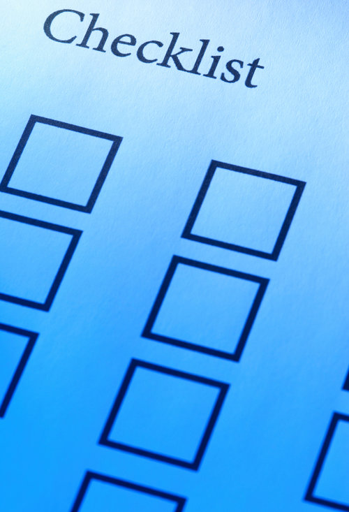 as details of your content. Today, I am going to list the details I check for when reviewing a draft for a document’s design elements.
This list is in the order I think of them, not necessarily in any importance.
- does the design complement your other materials, such as a website or business card? Does it suit your brand?
- is your logo and/or business name included and in an appropriate way?
- does the design match your message?
- do any paragraphs end with a single word on a line? Professional designers call these ‘orphans’ and do everything to avoid them! I have often adjusted text to pull that last word onto the previous line
- are headings and contents together? A heading at the bottom of a column and text in the next column is disjointed and looks strange
- do headings stand out enough? This includes table headings, too
- is there a consistent font size throughout the document? Headings may be bigger than the text, but should be the same as each other
- are any tables, diagrams or pictures clearly labelled? Sometimes formatting pushes labels away from the item
- can the design be adjusted to fit everything into one less page if it is currently an odd number? For example, printing is usually done in multiples of 4 pages so a 5 page document will actually need 8 pages printed
- does everything match any relevant rules or style guidelines?
- do contact details stand out sufficiently? People having to search for them are less likely to contact you
- are the right things emphasised? For instance, if you have text in highlight boxes, do they stand out from the text? Are disclaimers and privacy statements attracting more attention than your main message?
- are colours and fonts consistent throughout, except as design elements?
If you are happy with all of these details, you will be very close to the correct design for your needs.


